Terracotta and Earthy Color Trends: A Practical Designer Guide
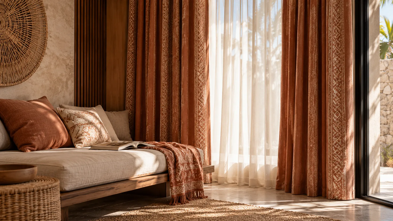
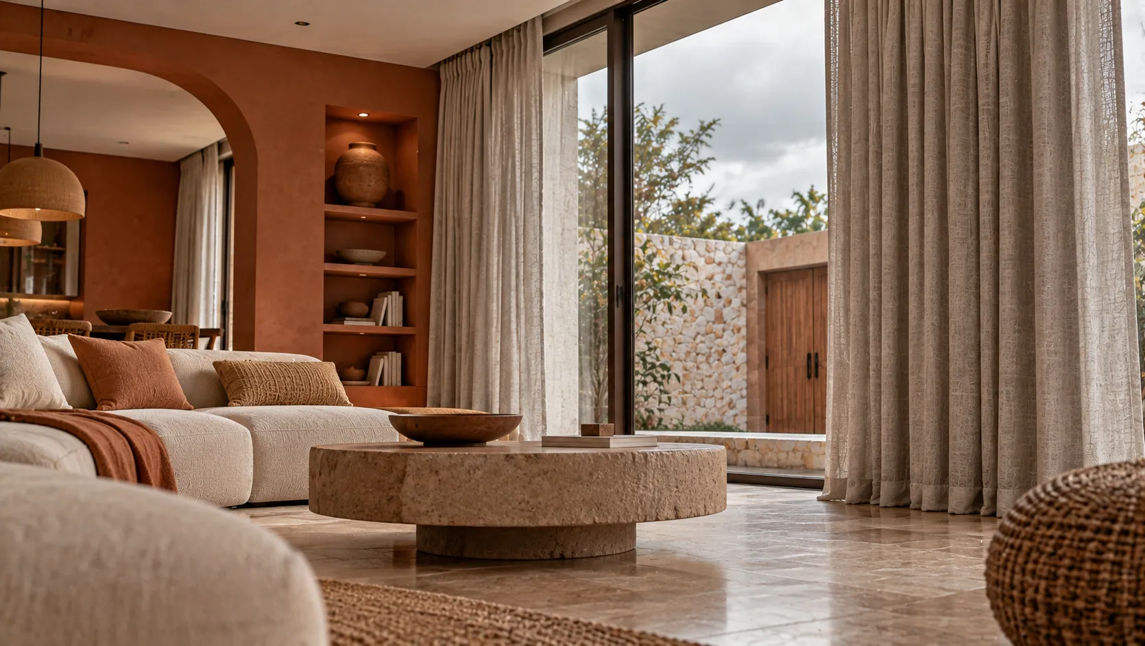
Terracotta and earthy colours bring warmth to interiors without requiring bright or highly saturated colours. In tropical properties, they can work especially well with timber, stone, woven materials and natural landscaping.
Which Earthy Colours Are Useful?
- Terracotta: warm and expressive, useful as an accent.
- Clay: softer and more muted than strong orange.
- Sand: versatile for large surfaces and curtains.
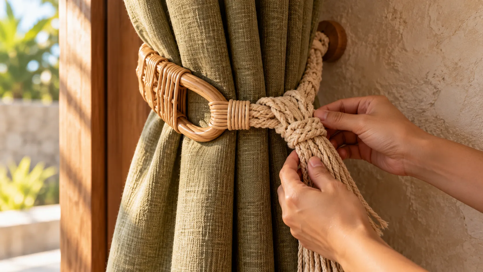
- Olive and muted green: useful for connecting interiors to vegetation.
- Warm taupe: a practical neutral for larger textile surfaces.
Should the Curtain Be Terracotta?
Not necessarily. Because curtains can cover a large area, a quieter sand, oatmeal or warm neutral fabric may provide a better foundation while terracotta is introduced through cushions, artwork or smaller furniture pieces.
Use our curtain colour and pattern checklist when comparing the palette.
Terracotta With Natural Textures
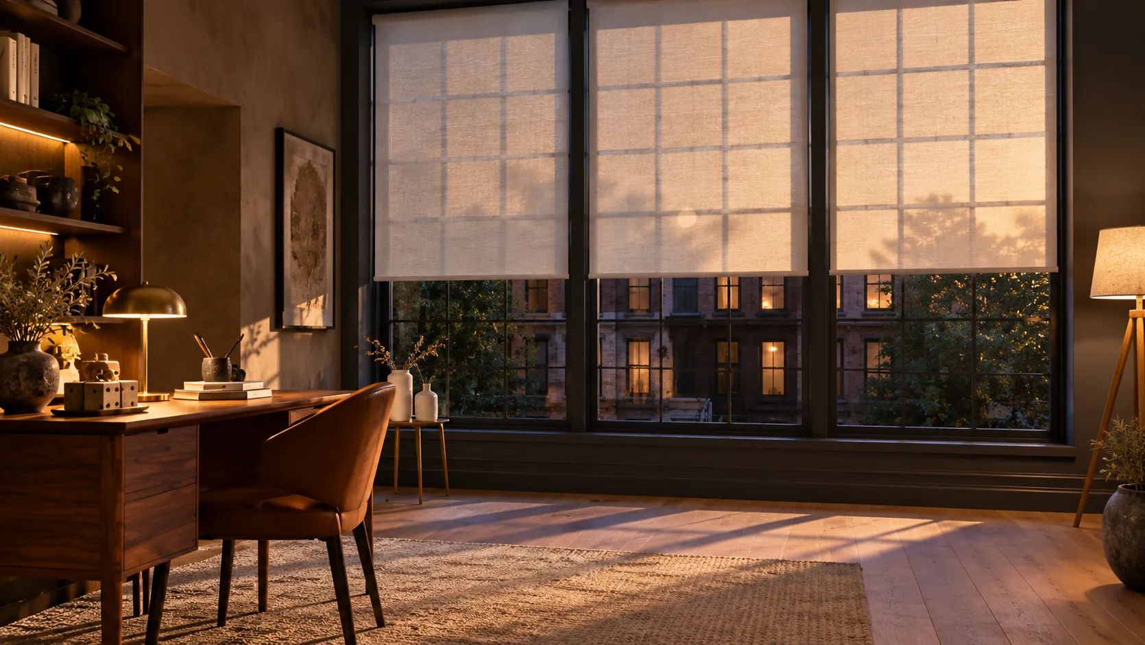
Linen-look fabrics, woven shades and textured curtains can prevent earthy colours from feeling flat. The combination works particularly well when the architecture is contemporary and needs softer material contrast.
Watch the Undertones
Two beige or terracotta fabrics can look very different depending on their undertone. Always compare samples against the actual wall, floor and daylight conditions.
Final Takeaway
Earthy colours are most effective when they are edited. Use one dominant warm neutral, introduce terracotta or clay as an accent, and let texture create additional depth.