Color Blocking Curtain Trends: What Designers Are Choosing Now
Colour-blocking curtains use two or more clearly defined colours or fabric sections to create a deliberate graphic effect. The look can bring energy to a simple room, echo colours already used in the interior or make a large window feel more considered. It works best when the colour placement is planned alongside the curtain’s proportions, fabric weight and light-control needs.
Choose a Clear Colour Strategy
Start with the room’s fixed finishes: walls, floor, cabinetry and large furniture. Then decide whether the curtain should blend in, echo an accent colour or become the main visual feature. A restrained palette often feels more enduring than combining several unrelated strong colours.
- Tonal blocking: combine nearby shades, such as ivory and sand, for a subtle result.
- Warm and cool contrast: pair a warm neutral with a muted blue or green accent.
- Light and dark panels: use a darker lower or side section to create visual weight, while checking how the proportions read from across the room.
Plan the Proportions Before Ordering
Colour blocking can be horizontal, vertical or arranged as contrasting curtain panels. The placement changes the impression of the window: vertical sections can emphasize height, while a horizontal band can visually divide a tall expanse. These effects depend on the room and should be tested against the actual window dimensions rather than chosen from a generic image.
Coordinate the Fabric, Not Just the Colour
Two fabrics in a similar colour may reflect light differently because of their weave, sheen and texture. If panels are meant to appear as one design, compare samples side by side in daylight and evening lighting. Confirm that the fabrics have compatible weight, drape and care requirements. Different thicknesses can hang unevenly or form visibly different folds.
Keep Function in the Design
A decorative colour scheme should not compromise privacy or light control. If the curtains need blackout lining, check that the lining and construction are suitable across all panels. For a layered window, the sheer and main curtain should work together when open and closed. Also consider whether the chosen colours will be exposed to strong sunlight, which may affect fading over time.
See our curtain colour and pattern checklist and window treatment colour inspiration for more ways to build a coherent palette.
Where Colour Blocking Works Best
In a neutral living room, a two-tone curtain can become a controlled focal point. In a bedroom, softer contrast may be easier to live with over time. Hospitality projects can use colour blocking to reinforce a brand palette, but the design should still be easy to maintain and repeat across multiple rooms.
Apply the Idea in Tropical Interiors
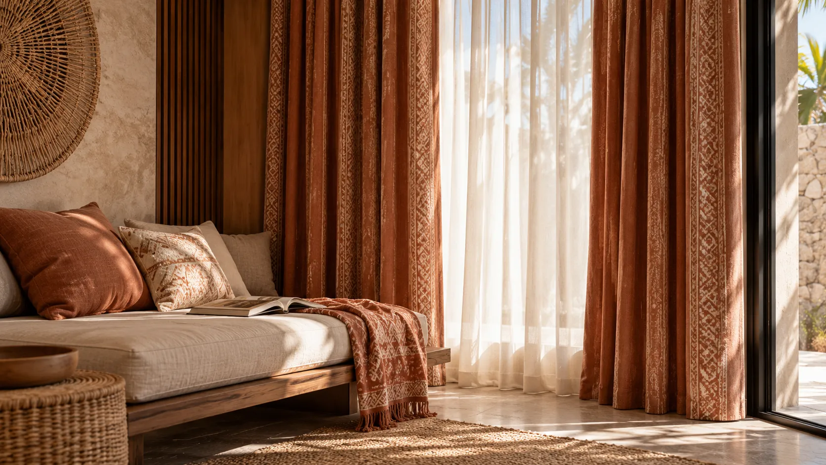
For a Bali villa, consider the colours of timber, stone, greenery and outdoor light. Sand, warm white, olive, terracotta and muted blue can sit comfortably within many tropical palettes, but sample them against the actual finishes. A strong colour may appear more intense in bright daylight than it does on a screen.
Common Mistakes to Avoid
- Using too many competing colours in a room that already has strong patterns.
- Ignoring the proportion of each colour relative to the window height and width.
- Combining fabrics with noticeably different weights or drape.
- Choosing from digital swatches without checking physical samples.
- Forgetting lining, privacy, cleaning and sun exposure requirements.
A Simple Decision Process
Choose the palette first, test fabric samples in the room, sketch the panel layout, then confirm finished dimensions and lining requirements. Review the design with the track or rod specification so that the intended colour arrangement remains clear when the curtains are stacked open.
For more inspiration, read our colour and texture trends guide. If you are considering custom colour-blocking curtains, Almeers Living can help compare fabrics and plan the panel layout around your windows.