Color Inspiration for Your Window Treatments
When designing a luxury interior, window treatments are often the defining finishing touch. The color of your curtains or blinds does more than just complement your furniture; it dictates the mood, controls the perception of space, and frames your view of the outside world.
Whether you are designing a serene tropical villa or a sleek modern apartment, selecting the right color palette is crucial. Here is our expert guide to color inspiration for your window treatments.
1. Crisp Whites and Soft Creams: The Airy Sanctuary
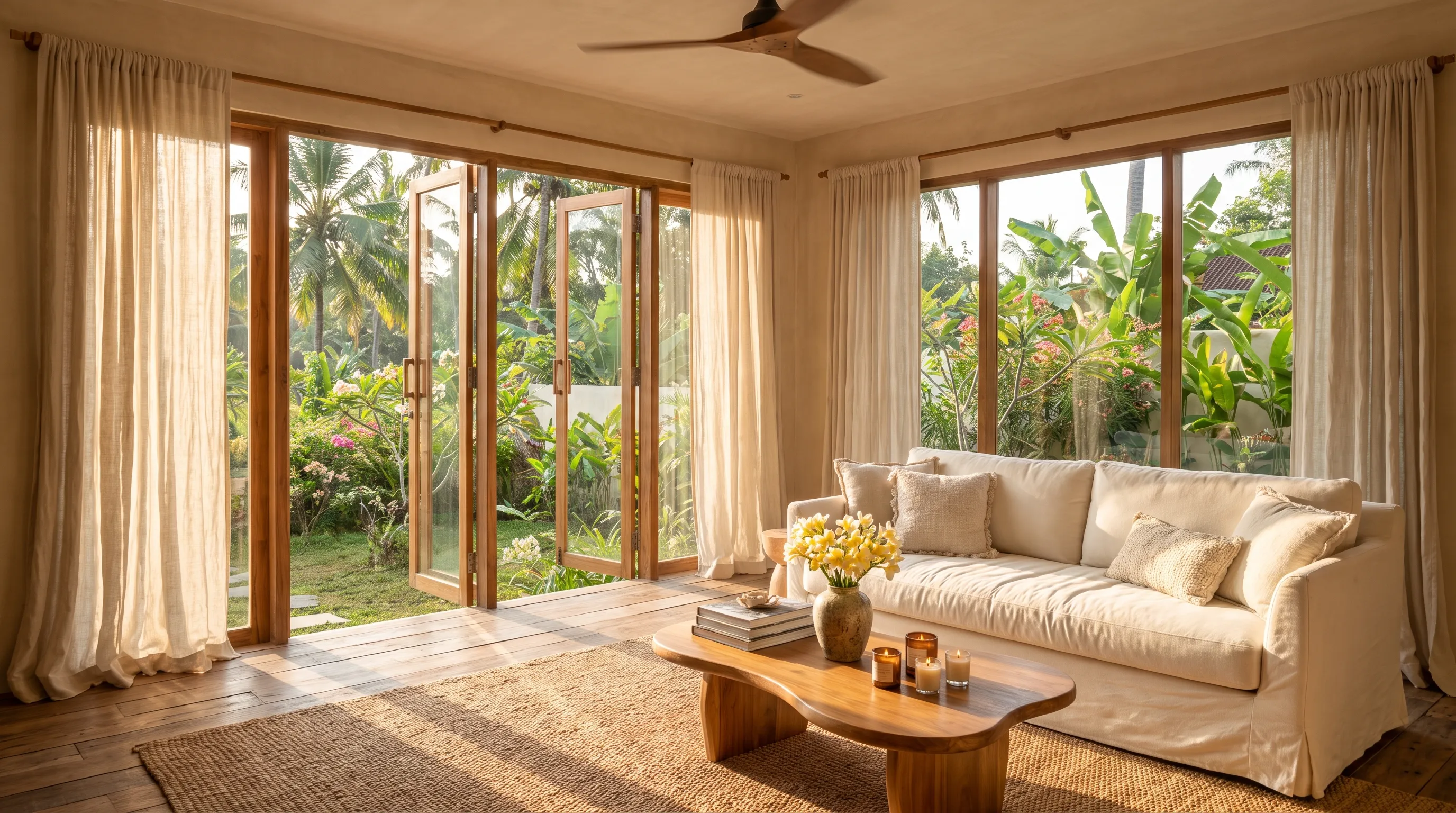
White, ivory, and cream are timeless choices that instantly make a room feel larger, brighter, and more inviting. These colors reflect natural light beautifully.
- Best For: Living rooms, sunrooms, and spaces where you want to maximize natural daylight.
- Fabric Pairing: These colors work exceptionally well with Sheer or Voile fabrics. The translucent nature of white sheers softens harsh sunlight while maintaining a breezy, open atmosphere.
2. Earthy Neutrals: Grounded and Organic
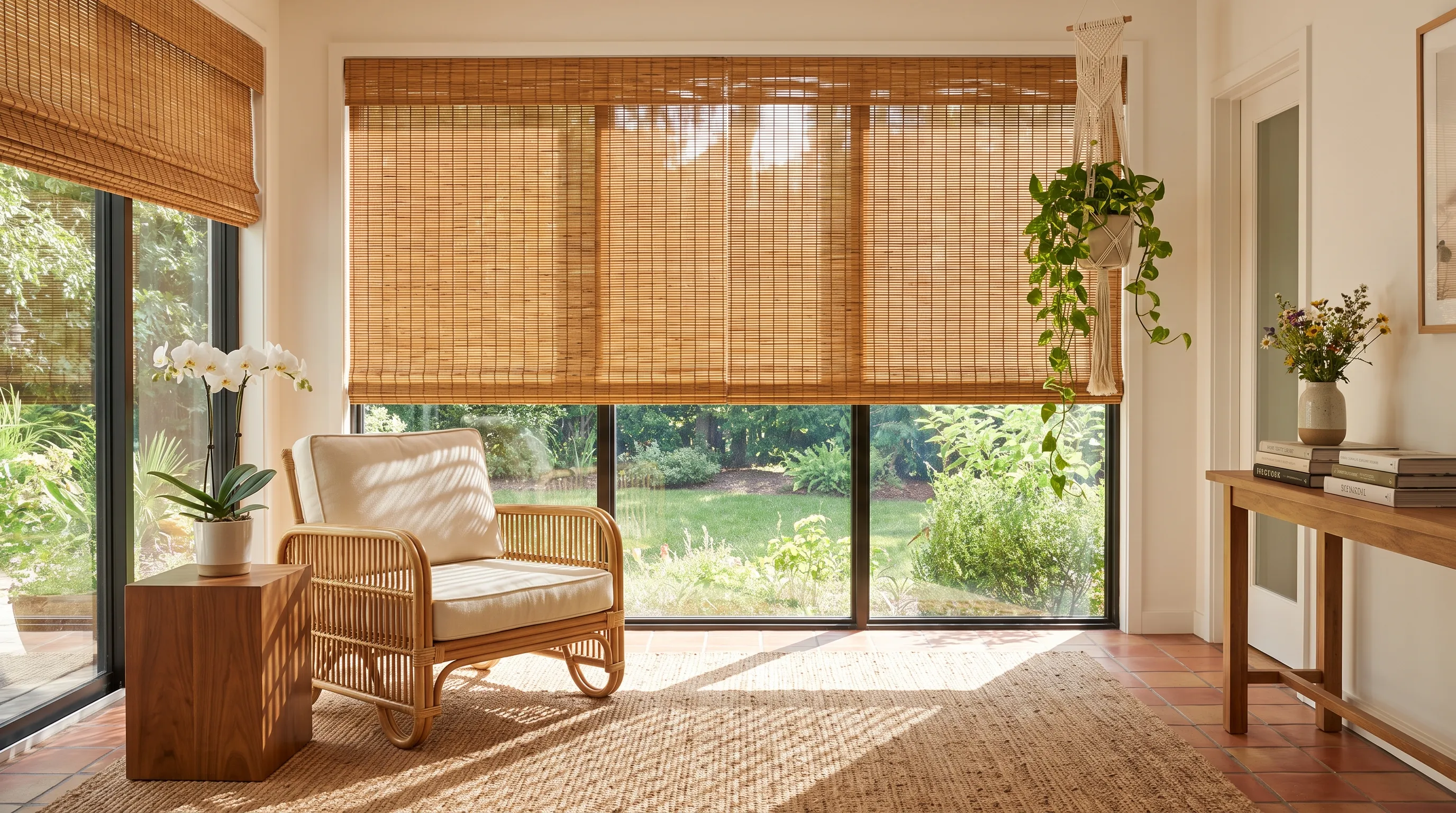
Drawing inspiration from nature, colors like warm taupe, sand, olive green, and soft terracotta bring a grounding, organic feel to an interior. These hues perfectly bridge the gap between indoor luxury and outdoor landscapes.
- Best For: Bedrooms and lounge areas designed for relaxation and tranquility.
- Fabric Pairing: Eco-Friendly Linen or textured woven fabrics in earthy tones add incredible depth and a tactile, resort-like quality to the room.
3. Deep and Moody: Bold Sophistication
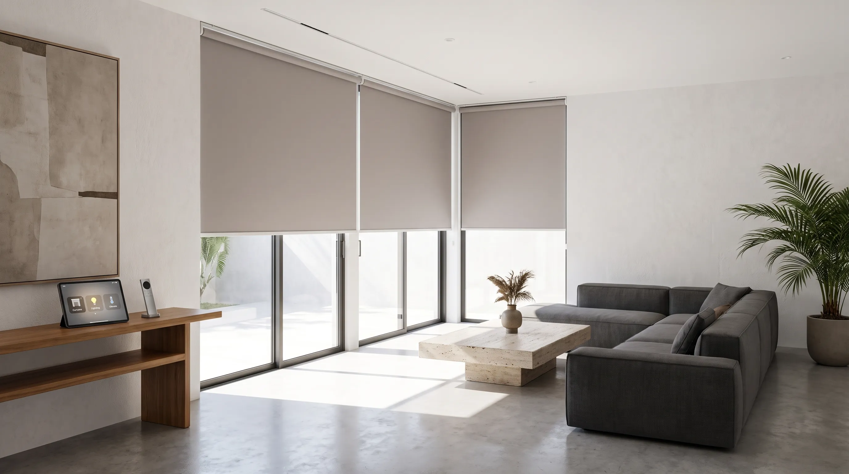
For a touch of dramatic luxury, deep colors like charcoal, navy blue, and emerald green are making a massive comeback. Dark window treatments create a striking contrast against light walls and add a layer of intimate sophistication.
- Best For: Master bedrooms, home theaters, and formal dining rooms.
- Fabric Pairing: These rich hues are ideal for Premium Blackout or heavy Dimout fabrics. Darker colors naturally absorb more light, enhancing the room-darkening effect and creating the ultimate private retreat.
4. The Power of Pattern and Texture
If solid colors feel too safe, consider subtle patterns or textured weaves. A monochromatic geometric pattern or a delicate botanical print can add visual interest without overwhelming the space. When working with patterns, keep the rest of the room's palette relatively subdued to let the windows stand out.
Bring Your Vision to Life
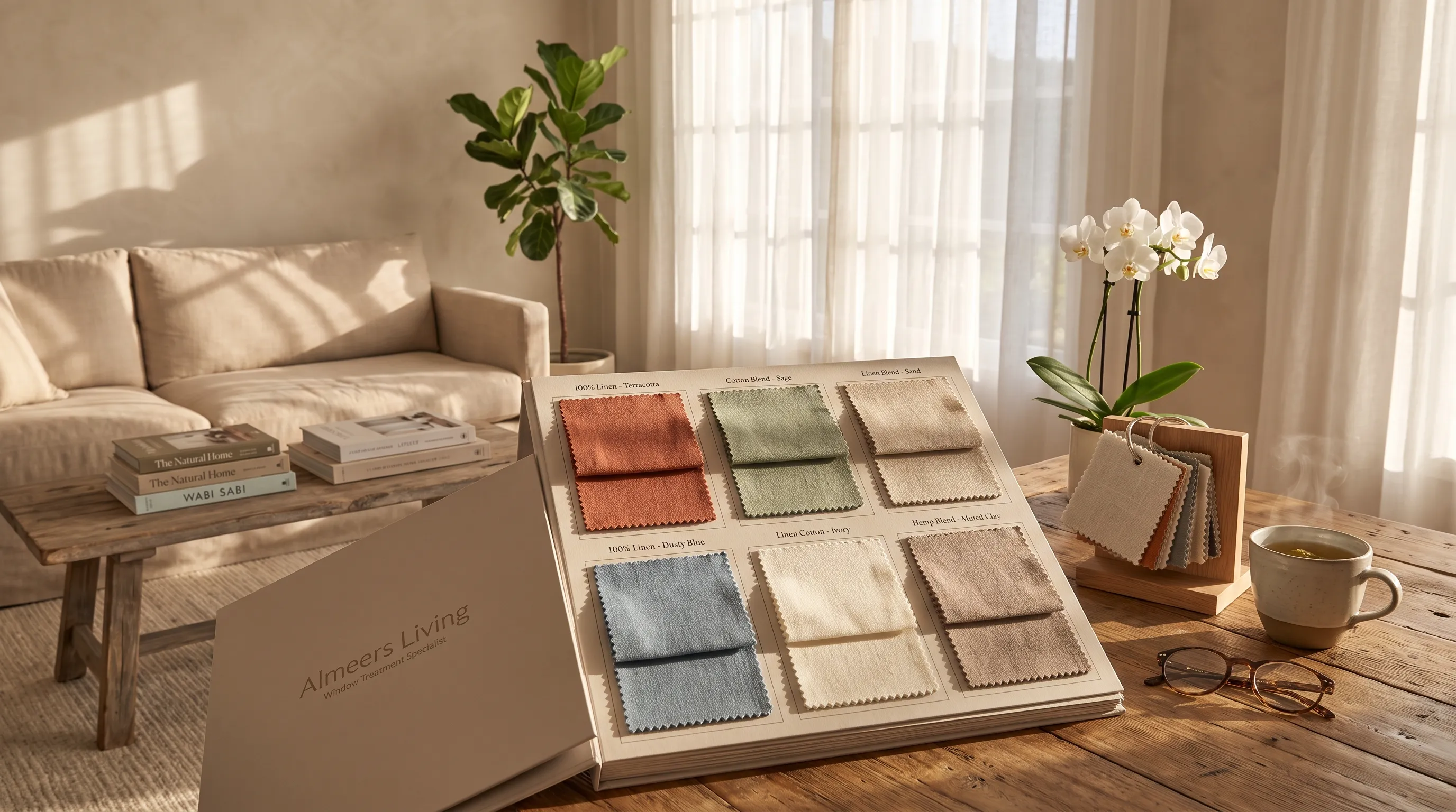
Choosing the right color is a deeply personal decision, but you do not have to make it alone. At Almeers Living, we offer an extensive catalog of premium fabrics in hundreds of stunning colors and textures.
Ready to transform your space? Click the "Chat on WhatsApp" button to schedule a free consultation with our design experts and find the perfect color palette for your window treatments!