Curtain Colour and Pattern by Room: A Practical Design Guide
Curtain colour and pattern should respond to the room, the natural light and the scale of the window. A colour that works beautifully in a bright living room may feel completely different in a shaded bedroom. Pattern adds another variable because repeat, direction and scale affect both appearance and fabric consumption.
Why Choose by Room?
Each room has a different visual and functional job. Bedrooms often benefit from calm combinations, living rooms may support stronger texture, and hospitality spaces need to work with the broader interior concept.
| Room | Design direction | What to check |
|---|---|---|
| Bedroom | Quiet neutrals or subtle texture | Light control, wall colour and bedding. |
| Living room | Natural tones, texture or controlled contrast | Window scale, flooring and furniture. |
| Dining area | Coordinated texture or restrained pattern | Lighting and visual connection to adjacent rooms. |
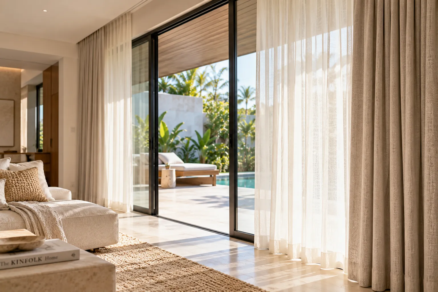
| Villa lounge | Natural earthy palette or architectural contrast | Stone, timber, landscape and daylight. |
Blend or Contrast?
A curtain can blend into the wall for a quiet architectural effect, coordinate with furniture for continuity, or contrast with the room to make the window a feature. None is universally correct; the decision depends on the intended visual hierarchy.
Pattern Scale Matters
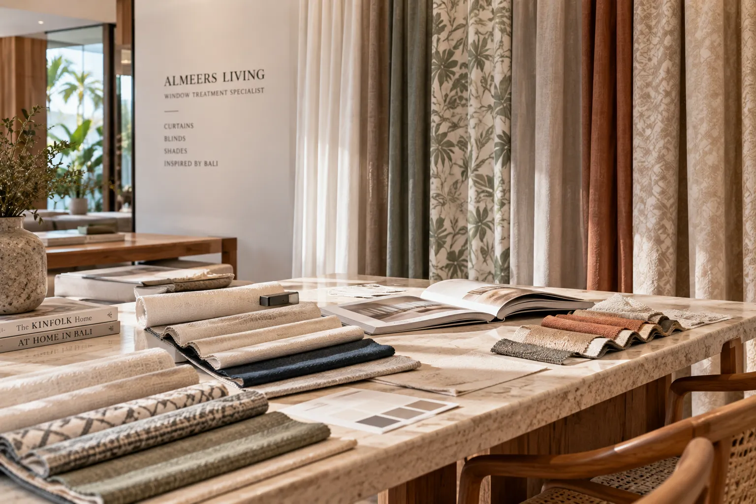
Large patterns can become visually dominant across floor-to-ceiling curtains. Small repeats may create a more subtle texture. Directional patterns also need to be checked against the curtain drop so the design is not unintentionally rotated or interrupted.
Colour Changes With Light
Morning, afternoon and evening light can change how a fabric appears. Warm daylight can make beige and cream feel richer, while cooler conditions can shift how grey or neutral tones are perceived. Always evaluate a fabric in the actual room when possible.
Texture Can Replace Pattern
A woven, slubbed or linen-look surface can provide visual depth without introducing a printed pattern. This can be especially useful when the room already contains strong flooring, artwork, timber grain or decorative elements.
Colour and Light Control Must Be Considered Together
Decorative colour should not be separated from performance. A light decorative curtain may need a lining or a second layer if the room also requires stronger privacy or light control.
Pattern and Fabric Consumption
Pattern repeat can affect cutting and fabric usage because panels may need to be aligned. For large curtains, confirm the repeat, direction and matching requirement before finalising the quantity.
Practical Bali Villa Approach
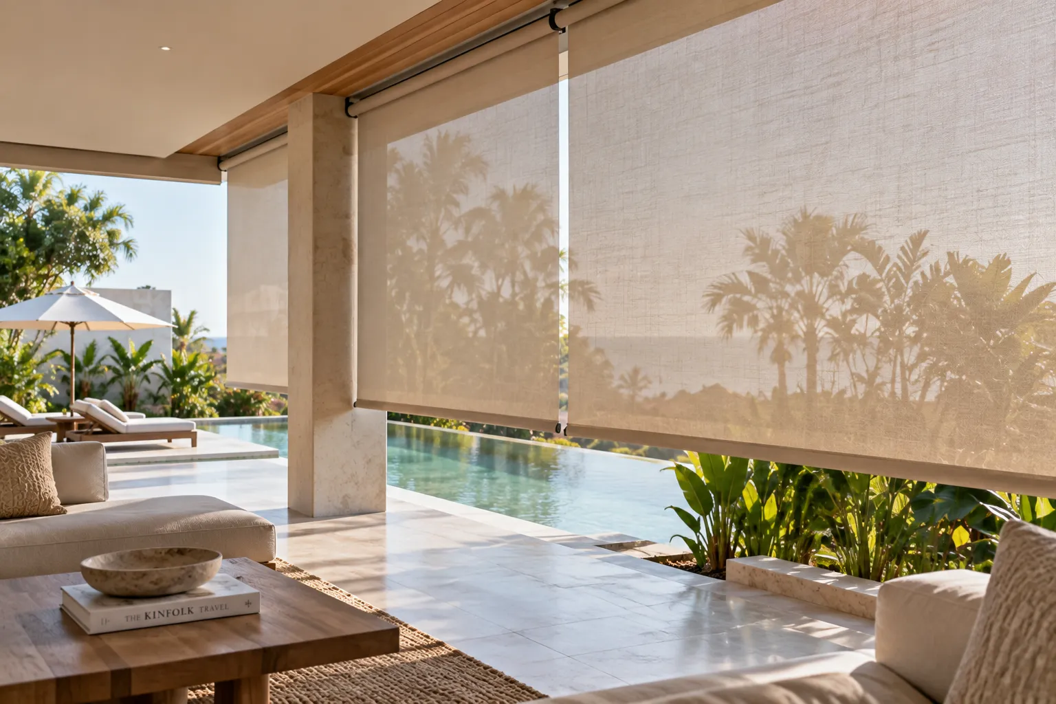
Natural neutrals and tactile fabrics can work well with timber, stone and tropical landscaping, but the property itself should determine the final palette. There is no single “Bali curtain colour” that works for every architecture.
Common Mistakes
- Choosing from a screen without viewing a physical sample.
- Ignoring natural and artificial lighting.
- Using multiple competing patterns.
- Forgetting pattern repeat and direction.
- Choosing colour without considering lining and light control.
Design Checklist
- Decide whether the curtain should blend or contrast.
- Check the wall, floor and furniture together.
- View the fabric at different times of day.
- Evaluate texture before adding pattern.
- Confirm pattern repeat and direction.
- Match colour choice with privacy and light-control requirements.
Bottom line: the most reliable curtain colour and pattern choice comes from the actual room, not from a universal trend. Scale, light, texture, architecture and performance should be evaluated together.