Warm Neutrals Replacing Cool Grays: The Bali Edition for Modern Villas
Cool grey dominated many interiors for years because it is easy to combine with white, black and contemporary finishes. But warmer neutrals are becoming more useful in spaces designed around natural stone, timber, woven textures and softer lighting.
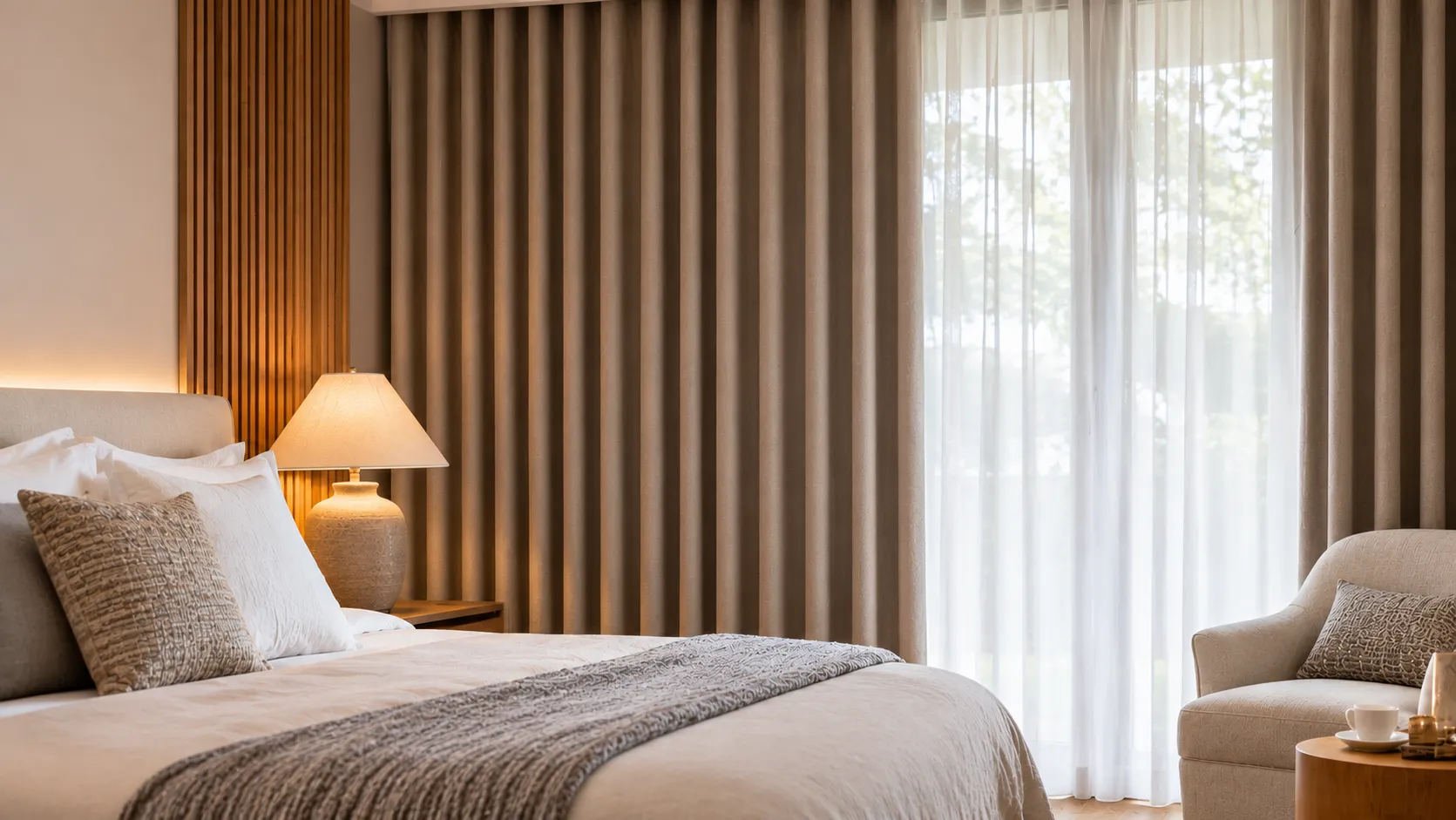
For curtains, this shift is important because a large expanse of fabric can influence the entire mood of a room. Warm neutrals such as sand, oatmeal, taupe, beige and soft stone can create a calmer result without making the interior feel old-fashioned.
Why Are Warm Neutrals Replacing Cool Grays?
The change is less about one colour going out of fashion and more about interiors becoming more tactile and natural. Warm palettes work easily with timber, travertine, natural stone, rattan and other materials commonly used in contemporary tropical interiors.
They also respond well to warm artificial lighting. A curtain that looks neutral in daylight can appear noticeably different under artificial lighting, so samples should be viewed in the actual room.
Which Warm Neutral Curtain Colours Work Well?
- Warm white: useful when you want brightness without a stark cool-white appearance.
- Sand and oatmeal: easy choices for natural, relaxed interiors.
- Taupe: useful when the room needs more depth.
- Greige: a bridge between grey and beige when existing finishes contain both.
- Soft earthy tones: suitable when you want the curtain to become a subtle feature.
Match the Curtain to the Materials Around It
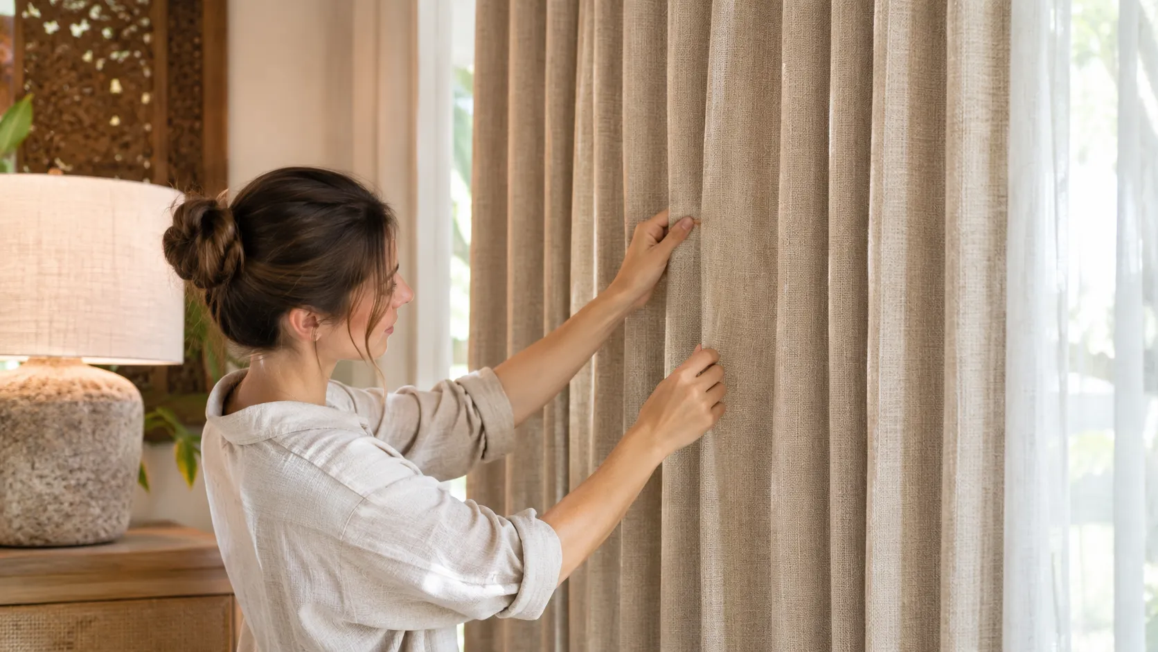
Do not select the curtain colour in isolation. Compare it against flooring, wall paint, timber, stone, upholstery and daylight. Two fabrics that look almost identical on a screen can behave very differently beside a warm stone floor or dark timber.
Use our curtain colour and pattern checklist when comparing options.
Warm Neutrals in Bali Villas
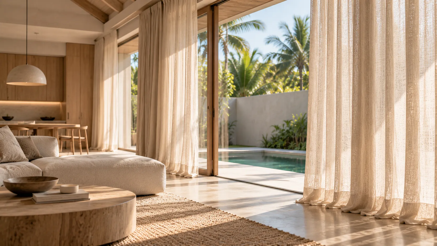
Warm neutrals work particularly well with tropical-modern architecture because they can soften large glazed openings without competing with the landscape. Linen-look fabrics, subtle weaves and full-height curtains can reinforce the connection to natural materials.
Should Every Room Use the Same Neutral?
Not necessarily. A consistent colour family is often more useful than one identical fabric. Bedrooms may use a slightly deeper tone for a quieter atmosphere, while living areas can use lighter sheers or warm off-white curtains.
How to Avoid a Flat Beige Interior
Use contrast through texture rather than simply adding more colours. A smooth wall, textured curtain, timber element and woven accent can create depth while remaining within a controlled neutral palette.
Final Takeaway
Warm neutrals are useful because they are both current and adaptable. The best choice is not the trendiest beige; it is the fabric whose undertone, texture and light response work with the room's architecture and materials.