Curtain colour has a powerful influence on how a room feels. It can soften strong daylight, bring warmth to a minimalist interior, connect furniture with architectural finishes, or create a quiet focal point around a window. In tropical homes, colour selection also needs to respond to bright sunlight, changing daylight throughout the day, outdoor greenery and the materials commonly used in contemporary villas and residences.
For Bali homes, the most successful curtain palette is rarely chosen from a colour chart alone. The colour needs to work with the room's wall finish, flooring, timber, stone, furniture, window frames and natural views. It should also suit the fabric's texture and opacity. A warm ivory sheer, for example, may look soft and luminous in daylight, while a deeper earthy curtain can add contrast and provide a more grounded evening atmosphere.
This guide explores aesthetic curtain colour inspiration for tropical homes, with practical ideas for modern properties, Bali villas, hotels and apartments. It explains how to build earthy neutral palettes, evaluate warm sunlight diffusion, balance colour undertones, combine curtain layers and avoid common colour-selection mistakes.
1. Why Curtain Colour Matters in Tropical Homes
Curtains occupy a significant visual area, particularly when they extend from ceiling to floor or cover wide sliding doors. Their colour can influence the perceived balance of a room and determine whether the window treatment blends into the architecture or becomes a design feature.
In a tropical setting, daylight can be bright and directional. The appearance of a curtain may change between morning, midday and late afternoon, and artificial lighting can alter it again after sunset. A neutral that appears creamy in warm evening light may look more grey beside cool daylight. This is why colour should be evaluated in the actual room rather than selected from a small online image alone.
- Visual continuity: colours close to the wall tone can make a room feel calm and visually connected.
- Architectural emphasis: a contrasting curtain can frame a window and give the opening greater presence.
- Atmosphere: warm neutrals often feel welcoming, while cooler neutrals can create a more restrained appearance.
- Layer coordination: the sheer, main curtain, track finish and surrounding materials should work together.
2. Earthy Neutral Palettes for Tropical Interiors
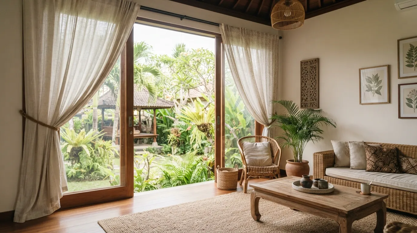
Earthy neutrals are a natural starting point for Bali interiors because they can complement timber, stone, woven textures, plaster finishes and garden views. Rather than using one flat beige throughout a property, build a palette from related shades with different depths and undertones.
Sand and oatmeal
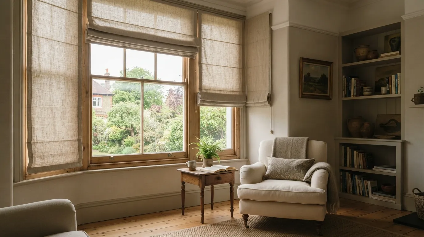
Sand and oatmeal tones create a relaxed, understated look. They work well with natural timber, warm flooring and soft off-white walls. Textured fabrics can add depth without introducing a strong contrast.
Stone and warm grey
Stone, greige and warm grey can balance interiors that include concrete, grey stone, dark metal or contemporary furniture. Check the undertone carefully: some greys lean blue or green and may feel disconnected from warm timber or cream walls.
Clay, taupe and muted brown
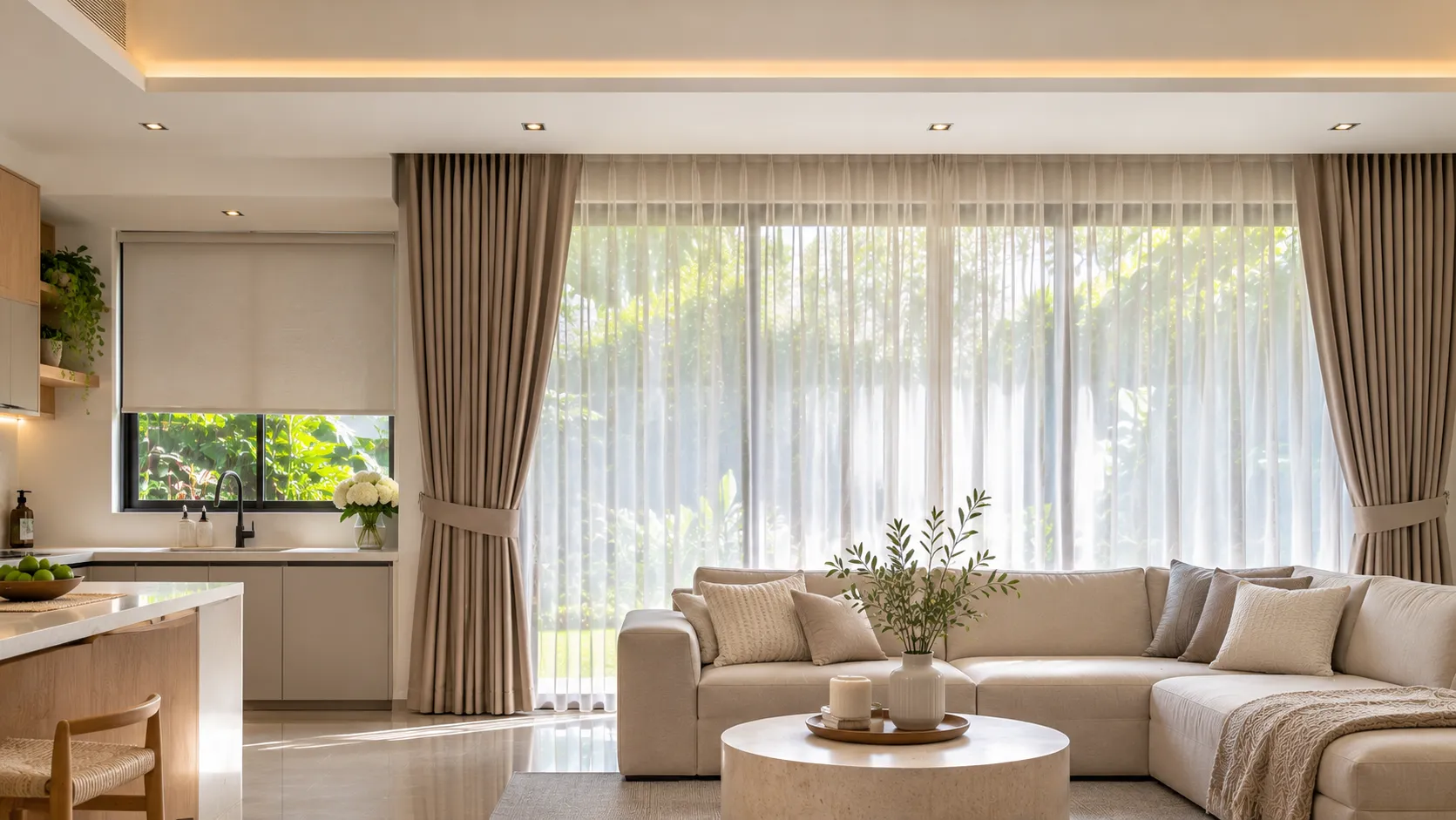
Clay and taupe introduce more visual weight while remaining connected to natural materials. They can be effective in bedrooms and living rooms where a slightly richer palette is desired. Use them as a main curtain colour or as an accent against lighter walls.
Olive and muted green
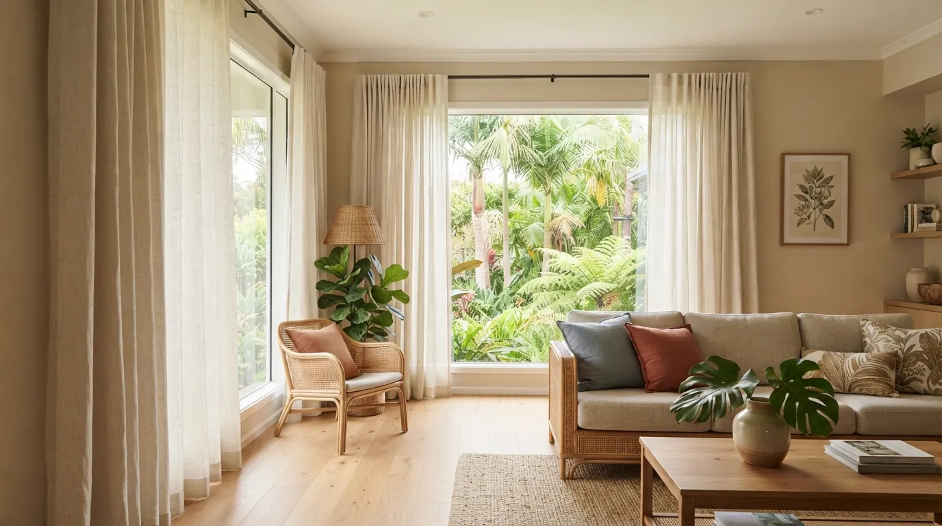
Muted olive and soft green can connect an interior with tropical planting. These colours are most successful when they relate to an existing element, such as upholstery, artwork or the garden view, rather than appearing as an isolated colour choice.
3. Warm Whites, Ivory and Soft Beige
Warm white, ivory and soft beige are versatile choices for sheer curtains and light-filtering window treatments. They can soften the transition between the interior and the outdoors without drawing too much attention to the window. In a room with warm timber or cream walls, an ivory sheer may create a more harmonious result than a stark, cool white.
However, white is not one single colour. Some fabrics have yellow, pink, grey or neutral undertones. A very cool white may look crisp beside black frames and cool stone, while a warmer ivory may suit natural wood and warmer wall finishes. Compare the sample against the actual wall and flooring before confirming the selection.
For a layered bedroom, a warm white sheer can be paired with a deeper blackout curtain in taupe, beige or muted brown. This gives the room a light daytime appearance and a more enclosed, restful feel when the outer layer is closed.
4. How Colour and Fabric Affect Daylight
Curtain colour and fabric construction work together. A pale sheer with an open weave generally allows more daylight through than a dense, dark fabric, but colour alone does not determine the amount of light entering a room. Fibre, weave, thickness, lining, opacity and installation coverage all matter.
When sunlight passes through a sheer, the fabric can diffuse the light and influence its perceived tone. A warm-toned sheer may make daylight feel visually warmer, while a neutral or cooler-toned fabric may preserve a cleaner appearance. The actual effect varies with the fabric and the light conditions.
For strong afternoon sun, consider the room's orientation, glazing and external shading. If glare or heat is a concern, assess a suitable lining, blind or layered treatment rather than expecting a colour change alone to solve the issue. Blackout and dimout products should be selected according to their stated specifications and the level of light control required.
5. Understanding Undertones and Colour Harmony
Two curtains can both be described as beige and still look very different beside the same wall. One may have a yellow undertone, another a pink undertone, and another a grey or green undertone. These subtle differences are often what make a colour combination feel harmonious or slightly uncomfortable.
A practical way to coordinate colours is to identify the dominant undertone in the room first. Look at the wall, flooring, timber, stone and large furniture pieces. Then choose a curtain that either shares that undertone for a quiet result or deliberately contrasts with it for a more defined look.
| Interior feature | Possible curtain direction | Design consideration |
|---|---|---|
| Warm timber and cream walls | Ivory, oatmeal, sand or warm taupe | Keep the palette warm and avoid an unintended cool-grey contrast |
| Grey stone and black frames | Stone, greige, charcoal or soft white | Repeat a tone already present in the architecture |
| Natural rattan and woven furniture | Flax, beige, muted olive or warm white | Use texture to create depth while keeping colours restrained |
| White minimalist interior | Soft white, pale grey, taupe or a considered accent | Choose whether the curtain should blend in or become a focal point |
| Green garden outlook | Warm neutrals, muted olive or earthy brown | Connect the interior palette to the landscape without matching it too literally |
6. Using Accent Colours with Confidence
Neutral curtains are flexible, but a stronger colour can give a room character. Deep olive, muted terracotta, dusty blue, charcoal and warm cocoa can all work when they are connected to the rest of the interior. The key is to use a colour with a clear role.
For example, a muted green curtain may echo a garden view or an upholstered chair. Terracotta can complement clay-toned accessories and warm timber. Dusty blue may provide a cooler counterpoint to sandy finishes. Charcoal can frame a large window in a contemporary room, especially when repeated in window frames or other metal details.
Before choosing a strong colour for a large curtain, test a sample at the window and consider how much fabric will be visible when the curtains are both open and closed. A colour that looks subtle on a small swatch can become much more dominant across a wide glazed opening.
7. Combining Sheer and Decorative Curtains
Layering offers flexibility and creates visual depth. A sheer layer can filter daylight and soften views, while a second curtain can provide additional privacy, stronger light control and a more substantial decorative finish. The colours should complement each other without necessarily being identical.
- Soft tonal layering: combine ivory sheers with beige, oatmeal or light taupe curtains for a calm, continuous palette.
- Warm contrast: pair a warm white sheer with a deeper clay, cocoa or muted brown outer curtain.
- Subtle cool balance: use a neutral sheer with stone or warm grey curtains in interiors with concrete and dark metal details.
- Nature-inspired pairing: combine a light neutral sheer with muted olive or earthy green where the room has a strong garden connection.
Consider the track arrangement, curtain fullness, fabric weight and stack space before finalising the design. A double track is commonly used when two independently operated layers are required. The installation should allow the curtains to move freely and stack without obstructing doors, handles or important views.
8. Curtain Colour Ideas for Different Rooms
Bedrooms
Bedrooms often benefit from a calm palette. Ivory, oatmeal, warm grey, taupe and muted earthy shades can create a restful appearance. If the room needs substantial darkness, select an appropriate blackout fabric or lining and plan the coverage around the window, rather than relying on a dark colour alone.
Living rooms
Living rooms are a good place to coordinate curtains with the largest visual elements, such as sofas, rugs, timber finishes and artwork. A sheer in a soft neutral can preserve a bright daytime atmosphere, while a coloured outer curtain can add depth and frame the view.
Dining rooms
Choose a colour that complements the dining table, chairs and lighting. Warm neutrals can create a welcoming setting, while a deeper accent can add definition. Consider cleaning requirements if the curtains are close to food preparation or frequent activity.
Bathrooms and moisture-prone areas
Colour should be considered alongside the suitability of the material for moisture exposure. Confirm the product's care and cleaning guidance and avoid specifying fabric in a location where it is likely to remain persistently damp.
Villa and hotel spaces
For hospitality properties, a coordinated palette across rooms can strengthen the overall identity of the property. It is not necessary to use the same curtain colour everywhere. Instead, repeat a small group of tones and adapt the opacity and fabric type to each room's function.
9. How to Test Curtain Samples Before Ordering
Colour samples are most useful when viewed in the environment where the curtains will be installed. Place the sample beside the wall, flooring, furniture and window frame. Review it in morning light, bright midday conditions and evening lighting. If possible, hang the sample vertically because fabric colour and texture can look different when viewed in its final orientation.
- Collect samples in the same colour family, including slightly warmer and cooler alternatives.
- Compare each sample against the largest fixed finishes in the room.
- Observe the fabric in natural daylight and under the room's artificial lighting.
- Check the sample's opacity and texture, not only its colour.
- Review how the colour works with the proposed sheer or lining.
- Confirm fabric composition, care instructions, availability and batch consistency before approval.
For accurate planning, review the curtain measuring guide, the shade measuring guide and the valances and cornices measuring guide. The curtain stacking calculator can help estimate the space required when curtains are drawn open.
10. Common Curtain Colour-Selection Mistakes
- Choosing from a screen alone: screen settings and lighting can make colours appear different from the physical fabric.
- Ignoring undertones: a beige with a cool undertone may not sit comfortably beside warm timber or cream finishes.
- Forgetting fabric texture: a textured weave can appear lighter, darker or more varied than a smooth fabric in the same nominal colour.
- Using too many unrelated neutrals: several similar shades can create visual disorder if their undertones do not relate.
- Assuming dark curtains block all light: opacity and perimeter coverage matter more than colour alone.
- Ignoring the outdoor view: garden planting, sea views and neighbouring buildings can influence how a curtain colour is perceived.
- Not considering the full curtain area: a small swatch may not communicate how a colour will look across a large window.
11. A Simple Colour-Harmony Method
If you are unsure where to begin, use a simple three-part approach. First, identify the dominant fixed colour in the room, such as the floor or wall. Second, choose a supporting curtain tone that shares or intentionally contrasts with its undertone. Third, introduce a smaller accent through cushions, artwork or accessories. This creates a visual relationship without requiring every item to match.
For example, a villa with warm stone flooring, natural timber and cream walls could use an oatmeal sheer, a warm taupe main curtain and muted olive accents. A contemporary apartment with grey flooring, black frames and white walls could use a soft stone sheer, a greige outer curtain and charcoal details. These are starting points rather than fixed formulas; always test the actual fabric samples in the property.
12. Frequently Asked Questions
What curtain colours work best in tropical homes?
Warm white, ivory, sand, oatmeal, beige, taupe, stone and muted earthy colours are versatile options. The best choice depends on the architecture, natural light, furnishings and desired atmosphere of the room.
Are beige curtains a good choice for Bali villas?
Beige can work very well with timber, stone, natural textures and tropical landscaping. Compare undertones carefully and choose a fabric whose composition and care requirements suit the room's conditions.
Do light-coloured curtains make a room brighter?
Light-coloured, relatively open-weave fabrics can help maintain a soft and bright appearance, but actual daylight transmission depends on weave, thickness, lining, glazing and installation coverage. Colour alone does not determine brightness.
Should curtain colours match the walls?
They do not need to match exactly. A close tonal relationship creates a quiet look, while a considered contrast can frame the window. Both approaches can work when undertones and surrounding finishes are coordinated.
Can I combine different curtain colours in one property?
Yes. Use a consistent palette across the property and vary the shade according to each room's function, light conditions and furnishings. Repeating a few related tones helps maintain a cohesive interior.
What colour is best for sheer curtains?
Warm white, ivory and soft neutral tones are popular because they can complement many interior palettes. The final choice should be checked against wall colour, daylight and the main curtain layer.
Do dark curtains provide better blackout performance?
Not necessarily. Blackout performance is determined by the fabric or lining specification and the way the treatment is installed. A light-coloured blackout fabric can provide strong light control when correctly specified, while a dark decorative fabric may still allow light through.
How can I choose curtain colours when furnishing a villa from overseas?
Request clear fabric information and physical samples where practical, and compare them with photographs or material samples from the property. Confirm measurements, product specifications, availability and installation details before approving production.
Conclusion: Build a Balanced Tropical Colour Palette
Aesthetic curtain colour inspiration for tropical homes starts with the character of the property. Earthy neutrals can complement natural materials, warm whites can soften daylight, and carefully selected accent colours can add personality. The strongest results come from balancing undertones, texture, opacity and the scale of the window rather than choosing a colour in isolation.
For Bali villas, hotels and modern residences, test fabric samples in the actual space and consider how sunlight, outdoor views and artificial lighting change their appearance. Coordinate the curtain layers with the architecture, and select each fabric according to its intended function and care requirements.
Explore the Almeers Living product range for custom curtains and blinds, or visit the Almeers Living blog for more practical window treatment guidance. Almeers Living supports custom window treatment planning in Bali, with options selected around each property's measurements, interior direction and functional requirements.