Choosing curtains is not only a matter of covering a window. Color, texture, fabric weight, and the way a curtain filters daylight all contribute to the atmosphere of an interior. A soft neutral can make a room feel relaxed and open, while a deep tone can create contrast, intimacy, and a more defined visual feature. The best choice depends on the room's purpose, its natural light, the existing materials, and the mood you want to create.
For properties in Bali, these decisions are especially important. Bright tropical daylight, warm timber, stone surfaces, greenery, and open-plan layouts can influence how a curtain color appears throughout the day. A shade that looks subtle in a fabric showroom may feel brighter beside a sunlit window or warmer against a timber floor. This guide explains how to choose curtain colors with both design intention and practical performance in mind.
Almeers Living helps homeowners, villa owners, hotels, interior designers, and property professionals in Bali select custom curtains and blinds that work with their interiors. Explore our curtain and blind collections or browse more advice in the Almeers Living design blog.
1. Why Curtain Color Matters in Interior Design
Window treatments occupy a significant visual area, particularly when curtains extend from ceiling to floor. Their color can either blend into the architecture or become a deliberate design feature. Because curtains sit between the interior and the outside view, they also influence how the room relates to daylight, landscape, and surrounding finishes.
Color helps establish the mood
Color associations are useful design starting points, but they are not universal rules. Personal experience, cultural context, lighting, and the colors surrounding a fabric all affect perception. Rather than assuming that one color always creates one emotion, consider the atmosphere you want and test the actual fabric in the intended room.
Color affects visual proportions
Curtains close to the wall color can create a continuous visual surface and make a compact room feel less interrupted. Strong contrast draws attention to the window and can make the curtain a focal point. Neither approach is automatically better: the right balance depends on the room's scale, architecture, and styling.
2. Understanding Curtain Color Psychology
Color psychology describes common emotional and visual associations. Use these associations as a framework for selecting a palette, then confirm the result with fabric samples and the room's real lighting.
| Color family | Common design impression | Where it can work well |
|---|---|---|
| Warm white, ivory, and cream | Soft, welcoming, light, and understated | Living rooms, bedrooms, and interiors with warm timber or natural stone |
| Beige, oatmeal, and taupe | Grounded, relaxed, and naturally layered | Villas, neutral interiors, and spaces with woven or timber finishes |
| Grey and greige | Balanced, restrained, and contemporary | Modern apartments, minimalist rooms, and interiors with cool or mixed finishes |
| Green and sage | Nature-connected, gentle, and restorative | Bedrooms, reading corners, and properties with garden or tropical views |
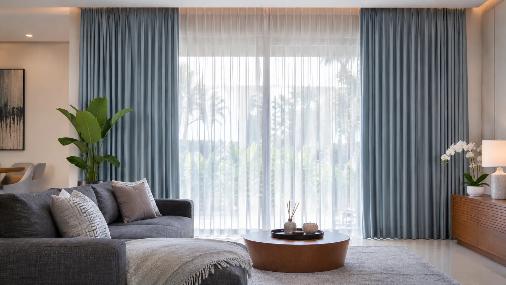
| Blue and muted navy | Composed, cool, and visually settled | Bedrooms, studies, and selected feature windows |
| Terracotta, rust, and muted clay | Warm, expressive, and earthy | Spaces with natural textures, warm lighting, and neutral furnishings |
| Charcoal and deep brown | Dramatic, intimate, and defined | Media rooms, large bedrooms, and interiors designed for strong contrast |
Warm neutrals for an inviting atmosphere
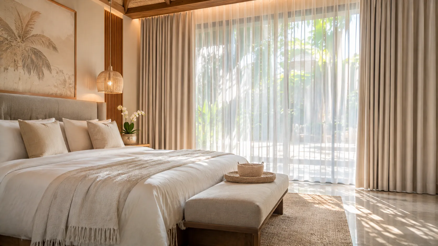
Ivory, cream, oatmeal, sand, and warm beige are versatile choices when the goal is a calm and welcoming interior. They coordinate naturally with timber, rattan, travertine, textured plaster, and many stone finishes. Warm neutrals can also soften a room with strong architectural lines without competing with artwork or furniture.
Cool neutrals for a restrained modern look
Soft grey, greige, and muted stone shades can complement concrete, metal details, and contemporary furniture. Check the undertone carefully: a grey fabric may look blue beside warm timber, while a beige-grey can appear warmer under evening lighting. Compare samples with the actual wall and floor finishes before confirming an order.
Nature-inspired colors for a relaxed interior
Sage, olive, muted blue, and earthy clay tones can connect an interior with its landscape. In Bali, these shades may work particularly well when the property includes garden views, tropical planting, timber, or stone. Keep the palette balanced by repeating the chosen color in small accessories or artwork rather than introducing too many competing accents.
3. How Natural Light Changes Curtain Color
A curtain does not look exactly the same in every lighting condition. Daylight direction, window size, surrounding surfaces, fabric texture, and the presence of a lining can all change its appearance. This is why selecting a color from a screen or a small printed image can be misleading.
Morning, midday, and afternoon light
- Morning light: Depending on the window orientation and weather, early daylight can make some colors appear cooler or softer.
- Midday light: Strong daylight can reveal undertones and make pale fabrics appear brighter. Direct sun may also create noticeable contrast between the illuminated and shaded parts of a curtain.
- Afternoon light: Warmer late-day light can make creams, beiges, and earthy tones appear richer, while cooler shades may look more muted.
- Evening lighting: Warm lamps can shift neutral fabrics toward yellow or amber. Check samples under the lighting that will be used most often at night.
Sheer curtains and light diffusion
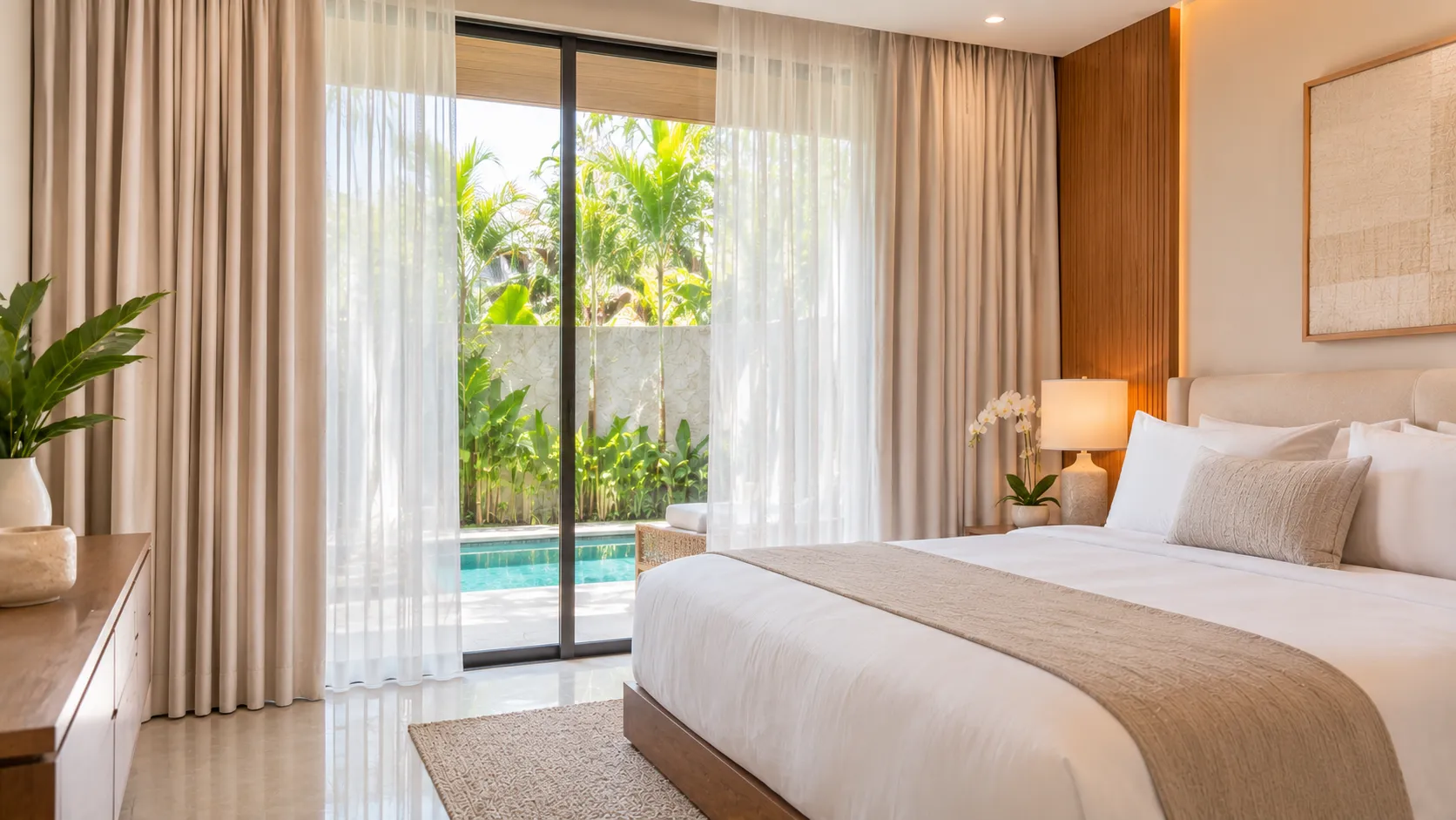
Sheer curtains soften incoming daylight while preserving a sense of brightness and visual connection to the outdoors. White, ivory, and natural linen-look sheers can create a light atmosphere, but the final appearance depends on weave density, fiber color, and the color of the glass or exterior view. A sheer is not necessarily a privacy solution after dark when interior lights are on.
Blackout curtains and color depth
Blackout curtains are selected primarily for light control and privacy, but their visible fabric color remains an important design decision. Darker colors can create a strong visual frame, while pale colors may help maintain a softer room scheme. Blackout performance depends on the fabric construction, backing or lining, track coverage, and installation details—not simply on whether the face fabric is dark.
4. Choosing Curtain Colors Room by Room
Living rooms: coordinate with the overall palette
Living rooms often contain several finishes and are used at different times of day. Warm ivory, oatmeal, taupe, and soft greige are flexible options for a calm foundation. If the furniture and walls are already neutral, a muted green, blue, or deeper earthy shade can add definition without making the room feel overly busy.
Bedrooms: create a restful visual environment
For bedrooms, consider colors that feel comfortable over long periods of use. Soft beige, warm grey, sage, muted blue, and dusty earth tones can support a quiet palette. If the room needs strong light reduction, combine the preferred face fabric with a suitable blackout construction and ensure that the curtain system covers the window effectively.
Dining areas: balance warmth and visual character
Dining spaces can accommodate richer color when it complements the table, chairs, lighting, and wall finishes. Natural linen tones, muted terracotta, olive, or deeper taupe can add character while remaining easy to coordinate. Consider whether the curtains will be viewed mainly in daylight or under warm pendant lighting.
Home offices: reduce visual distraction
Neutral and muted colors can create a composed background for work. Grey, greige, soft blue, and understated green are possible choices, but glare control should be considered separately. If screen reflections are a problem, evaluate the window orientation and choose an appropriate blind, sheer, or lined curtain combination.
Hospitality spaces: design for consistency and durability
Hotels and villas benefit from a palette that feels welcoming across rooms while responding to each space's architecture. A consistent neutral base can connect bedrooms and living areas, with selected accent colors used in feature spaces. For hospitality projects, also assess cleaning requirements, fabric durability, sunlight exposure, and replacement availability.
5. Connect Color with Fabric, Texture, and Function
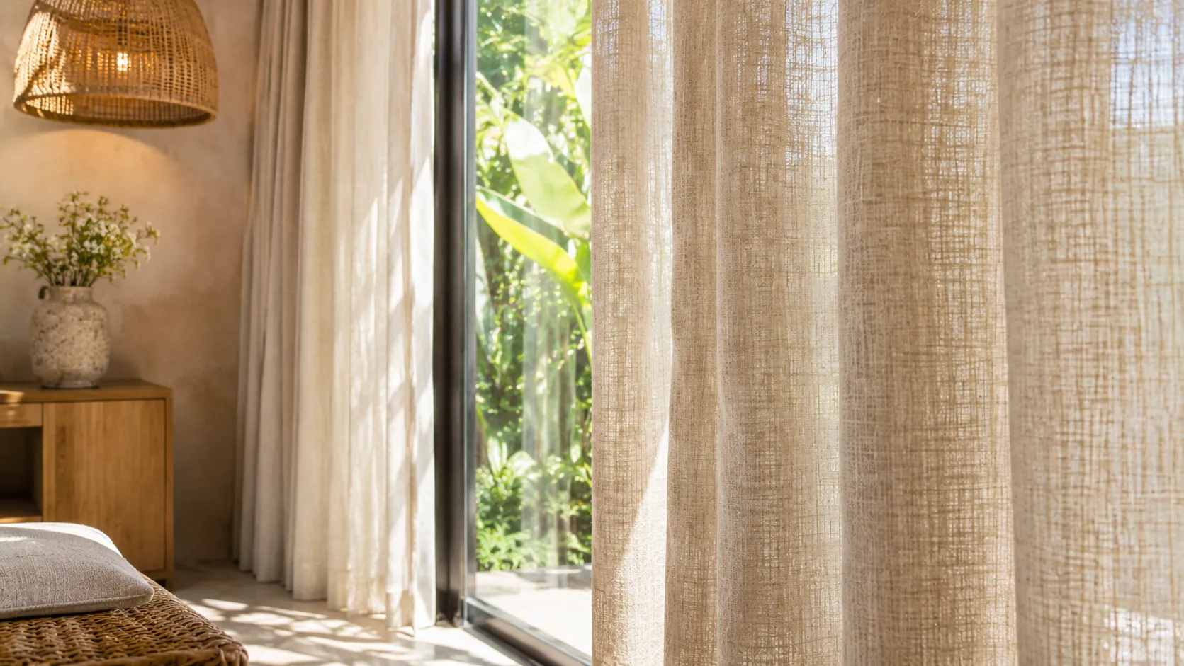
Color should never be selected independently of fabric. The same nominal shade can appear different in a smooth polyester, a textured linen-look weave, velvet, or a sheer fabric. Surface texture changes how light is reflected, while fabric weight affects the way the curtain hangs and folds.
Linen and linen-look curtains
Linen and linen-look fabrics are often chosen for their relaxed texture and natural appearance. Their subtle irregularities can make neutral colors feel more layered. They are suitable for interiors that emphasize organic materials, although the exact care requirements and light-filtering characteristics depend on the fabric composition.
Sheer and Vitrase curtains
Sheers are useful for softening daylight and adding a light visual layer. Natural white, ivory, and subtle warm tones are popular starting points. For daytime privacy, consider the view from outside and the brightness difference between indoors and outdoors; sheer curtains generally provide limited privacy at night.
Blackout and dimout curtains
Blackout fabrics are designed for substantial light blocking when paired with suitable construction and installation. Dimout fabrics reduce incoming light but do not necessarily provide complete darkness. Choose the color based on the room palette, then confirm the required light-control level with the supplier.
Blinds as an alternative or complementary layer
Roller blinds, Roman shades, Venetian blinds, and wooden blinds offer different ways to manage light and privacy. A blind can be used alone for a clean architectural look or combined with decorative curtains for added softness. Explore our custom window treatment options to compare styles and functions.
6. Curtain Color Palettes for Bali Homes, Villas, and Hotels
Bali interiors often combine bright natural light with timber, stone, textured plaster, greenery, and open views. The most successful curtain palette is one that responds to these materials rather than relying only on a trend image.
Warm tropical neutral
Combine ivory or warm white sheers with oatmeal, sand, or taupe curtains. This palette works with timber, rattan, limestone, and warm-toned furnishings. It can create a cohesive look across open-plan living spaces and bedrooms.
Soft botanical palette
Use natural white or light beige as a base, then introduce sage or muted olive in selected rooms. This approach can complement garden-facing villas and interiors with plants or green views. Keep the green tone muted if the room already contains strong natural colors.
Contemporary stone palette
Pair soft grey, greige, or warm charcoal with concrete, stone, and metal details. A textured fabric can prevent the scheme from feeling too flat. If the property has limited daylight, compare the darker samples carefully to avoid making the room feel heavier than intended.
Coastal-inspired palette
Soft whites, sandy neutrals, and muted blue can suggest a relaxed coastal atmosphere without relying on bright nautical colors. This palette is especially effective when the room has a sea or sky view, but it should still coordinate with fixed finishes and furniture.
7. A Practical Process for Selecting Curtain Colors
- Start with fixed finishes. Identify the undertones in the wall paint, flooring, ceiling, cabinetry, and large furniture pieces.
- Define the room's purpose. Decide whether the priority is a relaxed bedroom, a bright living area, a formal hospitality space, or a room requiring strong light control.
- Choose a palette direction. Decide whether the curtains should blend with the walls, complement the furnishings, or create a controlled accent.
- Compare physical fabric samples. Place samples beside the wall, floor, and furniture. View them in morning, midday, and evening light where possible.
- Check fabric texture and drape. Look at the sample vertically and consider how the fabric will appear when gathered into pleats.
- Confirm practical performance. Review light filtering, blackout or dimout requirements, privacy, cleaning, and sun exposure.
- Measure and plan the installation. Confirm track position, finished curtain height, stack-back space, and the desired fullness before production.
Accurate measurements are essential to the final appearance. Use our curtain measuring guide before confirming dimensions. For blind projects, see the shade measuring guide. If you are planning a pelmet or decorative top treatment, our valances and cornices measuring guide may also help. You can estimate how much space curtains occupy when open with the curtain stacking calculator.
8. Common Curtain Color Selection Mistakes
- Choosing from a screen alone: Digital images cannot reliably show exact undertones, texture, or how a fabric responds to the room's light.
- Ignoring undertones: Two beige fabrics may look very different beside the same floor or wall color.
- Forgetting the curtain's full size: A small swatch can feel subtle, while a full-height curtain creates a much larger field of color.
- Using color as a substitute for performance: Dark fabric does not automatically guarantee blackout performance, and sheer fabric does not guarantee night-time privacy.
- Overlooking the track and hardware: Track visibility, finish, and installation position influence the final visual result.
- Following trends without considering the property: A popular color may not suit the fixed finishes, lighting, or intended use of the room.
9. Custom Curtain Consultation and Installation in Bali
Custom curtains allow the color, fabric, heading style, dimensions, and hardware to be considered together. This is particularly useful for villas, hotels, apartments, and renovation projects where windows may vary in size or shape. Almeers Living supports clients in Bali with fabric selection, on-site measurement, custom production coordination, and installation.
For international property owners visiting Bali, the process can also be arranged around a visit to the property. Clients can review fabric samples, confirm their preferred colors, and coordinate delivery and installation locally. This helps avoid choosing a fabric based only on a photograph or screen preview.
To discuss a project, browse the Almeers Living product range or contact the team to arrange a consultation and measurement appointment.
Frequently Asked Questions
What curtain colors make a room feel calm?
Warm neutrals, soft greige, muted sage, and subdued blue are common choices for calm interiors. The best option depends on the room's lighting, surrounding finishes, and personal preference. Always compare fabric samples in the actual space.
Do light-colored curtains make a room look bigger?
Light-colored curtains can help create a brighter, more continuous appearance, especially when they are close to the wall color. However, room proportions, curtain placement, fabric fullness, and daylight also influence how spacious a room feels.
Are beige curtains suitable for Bali villas?
Beige, oatmeal, and warm taupe often coordinate well with the timber, stone, woven textures, and natural finishes used in Bali properties. Check the undertone against the actual materials because some beige shades may appear yellow, pink, or grey under different lighting.
Should curtains match the wall color or the furniture?
They do not need to match either exactly. Curtains can blend with the wall for a subtle look, complement furniture for a coordinated palette, or provide a controlled accent. Choose the approach that best supports the room's overall design.
Are dark curtains better for blocking sunlight?
Not necessarily. Light control depends on the fabric construction, lining or backing, coverage, and installation. A properly specified blackout curtain can be available in different face-fabric colors. Confirm the performance specification rather than judging by color alone.
Can sheer curtains provide privacy?
Sheer curtains can soften views and provide some daytime screening when the exterior is brighter than the interior. They generally do not provide reliable privacy at night when interior lights are on. Consider a double-layer system if both daylight diffusion and stronger privacy are required.
How can I choose the right curtain color before ordering?
Compare physical samples beside your wall and floor finishes, view them at different times of day, and consider the full curtain size and fabric texture. For custom projects, an on-site consultation can help assess the color in the actual room.
Conclusion: Choose Curtain Colors with the Whole Room in Mind
Curtain color can influence the mood, visual balance, and perceived brightness of a room, but it works together with natural light, fabric texture, window proportions, and practical requirements. Warm neutrals offer a flexible foundation, nature-inspired shades can connect interiors with the landscape, and deeper colors can create a more defined focal point. The most reliable choice is one tested in the real space and selected as part of the complete window treatment design.
For custom curtains and blinds in Bali, Almeers Living can help you compare fabrics, plan measurements, and coordinate a window treatment solution that complements your property.