How to Choose a Blind Colour: Match the Frame, the Wall or the Floor? — Interior Palette Harmony, Contrast Balance, and Room Lighting Effects
Selecting the correct color for custom window blinds is a critical design choice that shapes the visual harmony of an entire room. When browsing fabric swatches and slat finishes, homeowners often ask: Should window blinds match the window frame, the wall color, or the flooring?
Mastering interior palette harmony, contrast balance, and room lighting effects ensures your window treatments elevate your overall interior design.
1. Matching the Wall Color: Seamless Minimalist Unity
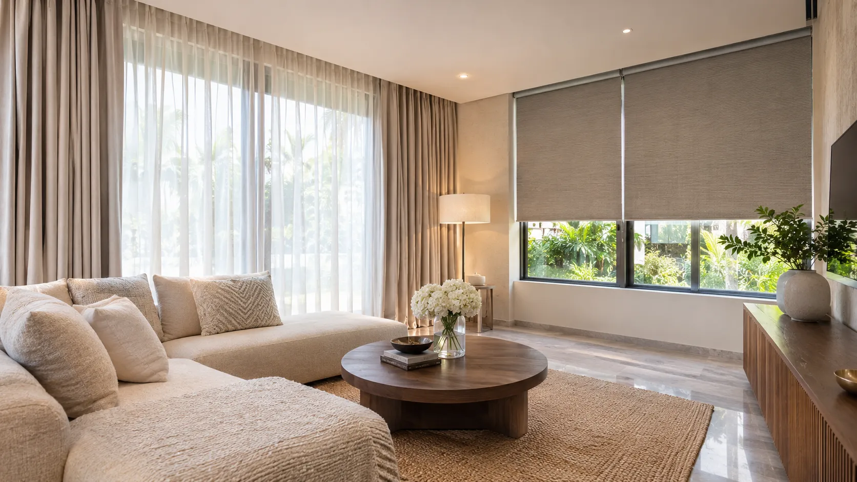
Choosing blind colors that match or sit in the same tonal family as your interior walls creates a seamless, built-in architectural effect. This approach minimizes visual clutter, making compact rooms feel larger, brighter, and more expansive.
2. Matching the Window Frame: Clean Structural Definition
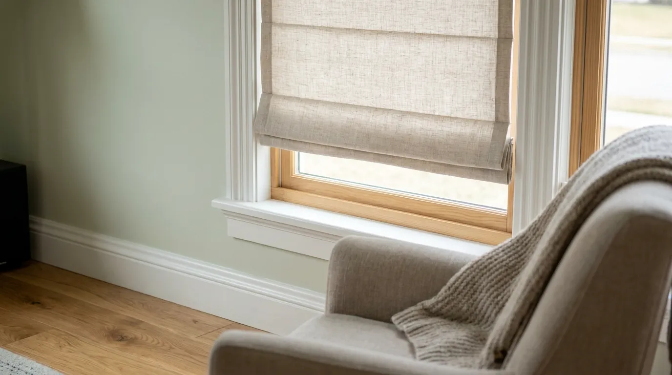
Coordinating your blinds with your window frames (such as matte black aluminum or crisp white timber joinery) establishes clean structural framing. When lowered, the blinds integrate neatly into the window architecture, providing a polished, deliberate aesthetic.
3. Contrasting with Flooring and Furniture Accents
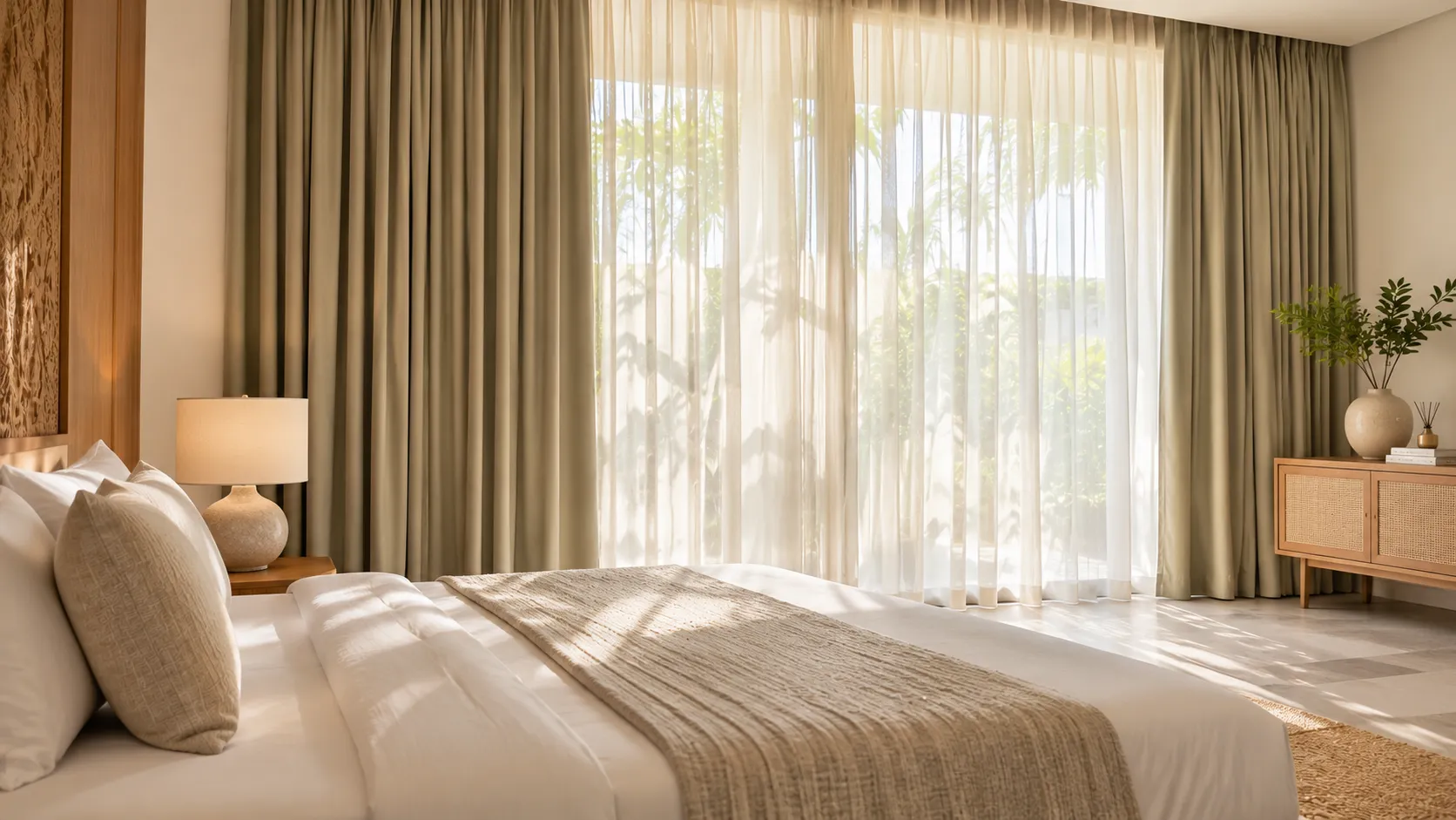
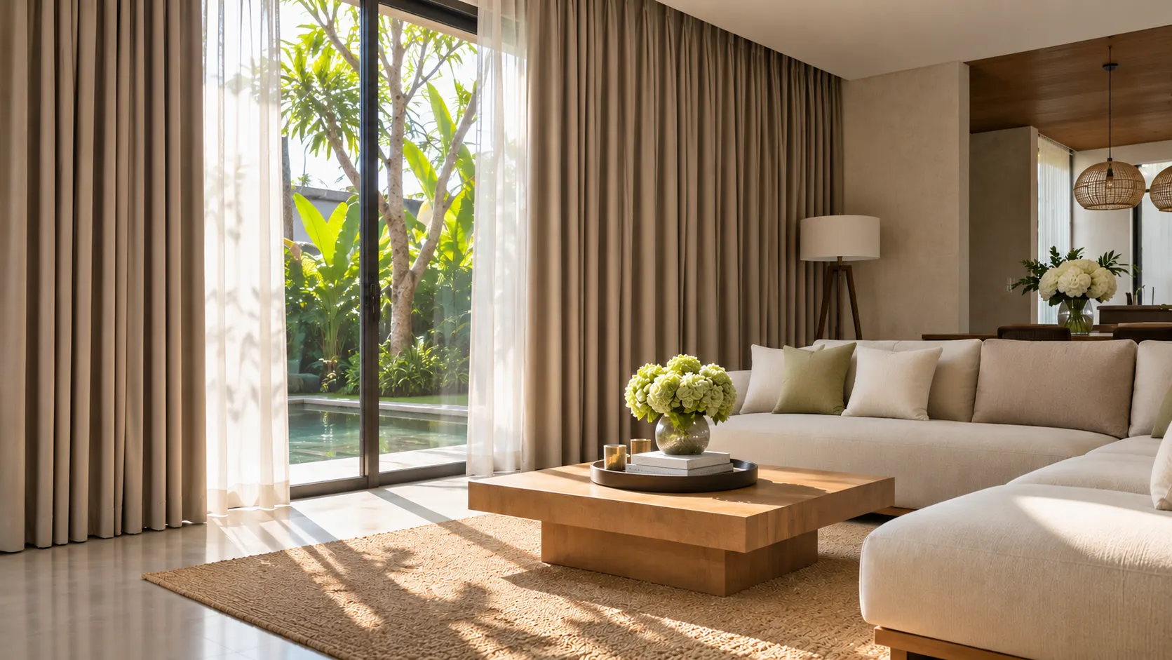
Using blinds to introduce contrasting tones—such as warm natural timber grain against micro-cement floors, or charcoal gray shades against neutral cream walls—adds sophisticated depth and tactile richness to modern tropical interiors.
4. Expert Color Styling with Almeers Living
Find the perfect color palette for your home with professional guidance. As a trusted window treatment specialist in Bali, Almeers Living offers extensive fabric swatch consultations and custom color matching for luxury residential projects.