How to Make a Statement with Bold Curtains: Practical Ideas for Modern Properties — High-Contrast Color Palette Selection, Focal Point Drapery Styling, and Visual Texture Balance
Interior Styling Guide · Almeers Living
How to Make a Statement with Bold Curtains: Practical Ideas for Modern Properties
Curtains do more than cover windows. In a well-planned interior, they can establish a focal point, introduce color, add visual depth, and connect different finishes across a room. Bold curtains make that impact more noticeable—but the result should feel intentional rather than overwhelming.
This guide explains how to select a high-contrast color palette, style statement drapery, and balance visual textures in contemporary homes, apartments, villas, and hospitality properties.
1. What Makes Curtains a Bold Design Statement?
A statement curtain is not defined by color alone. It may stand out through a saturated shade, dramatic contrast, a large-scale pattern, a rich surface, or a strong full-height silhouette. The most successful designs have a clear relationship with the room's architecture and furnishings.
Bold curtains work especially well when the rest of the room has a calm foundation. Neutral walls, simple furniture shapes, and uncluttered finishes give a distinctive curtain fabric room to be noticed.
- Color: deep green, navy, terracotta, burgundy, mustard, or a confident warm neutral.
- Contrast: a clear difference between the curtain and the wall, flooring, or upholstery.
- Texture: velvet-like pile, woven linen-look surfaces, structured jacquards, or visibly textured fabrics.
- Scale: generous fabric width and full-height installation that gives the window visual presence.
The objective is not to make every element compete. Choose one dominant statement and let the other finishes support it.
2. Choose a High-Contrast Color Palette
Color contrast helps curtains become a deliberate design feature. Before selecting a fabric, look at the wall color, floor tone, furniture, artwork, and natural light at different times of day. A swatch can appear warmer, cooler, brighter, or darker depending on its surroundings.
Dark curtains against light walls
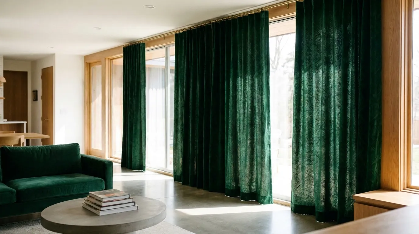
Deep navy, forest green, charcoal, or burgundy can create a strong outline against white, ivory, or pale beige walls. This approach suits modern spaces with clean architectural lines. To keep the room balanced, repeat a small amount of the curtain color in cushions, artwork, a rug detail, or decorative accessories.
Warm statement colors in neutral interiors
Terracotta, rust, ochre, caramel, and muted mustard can add warmth to rooms with stone, timber, cream, or greige finishes. These colors are effective when the palette already includes natural materials. Use undertones as a guide: warm fabrics generally sit more comfortably beside warm wood and creamy finishes.
Tonal contrast for a sophisticated effect
A bold look does not always require a bright color. A darker shade of the wall color, or a richer version of an existing neutral, can create depth without introducing a new color family. Taupe walls paired with deep mocha curtains, for example, can feel expressive while remaining restrained.
A simple palette method
- Identify the room's dominant neutral: wall, floor, or largest upholstery surface.
- Choose one curtain color that contrasts clearly or deepens that neutral.
- Select one or two supporting tones from existing furniture, artwork, or accessories.
- Check the fabric sample beside the actual finishes and in daylight and evening lighting.
For a cohesive result, avoid introducing several unrelated accent colors at once. One strong curtain color is often enough.
3. Make the Curtains the Focal Point
To make statement drapery feel architectural, consider the full window composition—not just the fabric color. Track position, curtain height, fullness, heading style, and the way the panels stack when open all influence the final appearance.
Use full-height drapery where appropriate
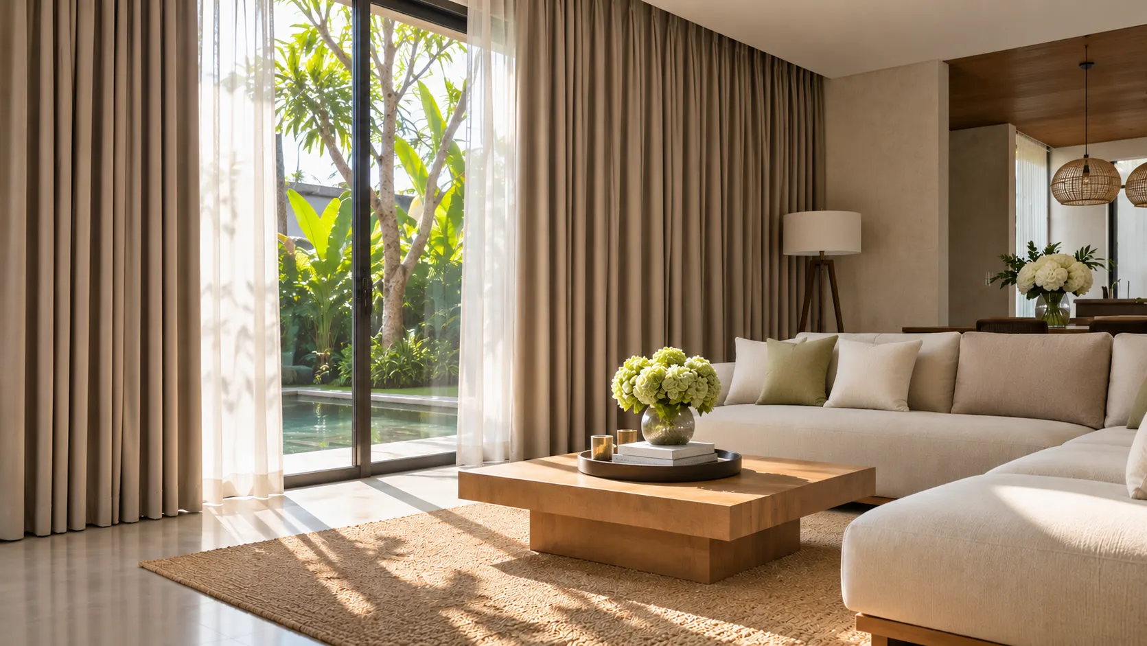
Installing curtains close to the ceiling and allowing them to finish near the floor can emphasize vertical lines and make a room feel more cohesive. This is often effective in villas, apartments, and rooms with tall glazing. The exact position should account for ceiling details, air-conditioning units, cornices, window frames, and floor levels.
Choose a heading that supports the design
- Wave or S-fold: creates a regular, contemporary rhythm and works with a suitable track system.
- Pinch pleat: gives a more tailored, structured appearance.
- Eyelet: creates a casual, visible-rings look and requires a compatible pole.
- Pencil pleat or gathered heading: offers a softer traditional finish, depending on fabric and fullness.
For a clean modern statement, wave-fold or tailored pleats are common options. The correct choice depends on fabric weight, track or pole, desired fold shape, and operation.
Give the fabric enough presence
Fabric fullness affects the depth and rhythm of the folds. Too little fabric can make a curtain look flat and reduce its visual impact. The appropriate fullness depends on the heading system, fabric thickness, track design, and available stacking space. Confirm the calculation with the curtain maker rather than applying one ratio to every fabric.
Keep the hardware visually consistent
A concealed track can help the fabric remain the main feature. A decorative pole can instead become part of the design. Coordinate visible hardware with nearby metal finishes where possible, and make sure the support system is suitable for the curtain's weight and span.
4. Balance Color, Pattern, and Visual Texture
Bold curtains can add a lot of visual information to a room. Balance that effect by varying texture thoughtfully and limiting competing patterns.
Pair one rich texture with quieter surfaces
A textured or velvet-look curtain can work beside smooth walls, simple upholstery, and understated flooring. If the curtain already has a strong surface, avoid placing several other highly textured materials directly beside it.
Mix materials with different visual weights
Combine soft drapery with harder finishes such as timber, stone, glass, or metal. The contrast between soft folds and firm architectural surfaces gives the room dimension. Natural woven fabrics can soften contemporary interiors, while a dense, smooth fabric can bring a more formal character.
Use patterns selectively
If the curtains feature a large-scale pattern, keep nearby upholstery and rugs relatively restrained. If the curtains are a solid bold color, a smaller pattern elsewhere may add interest. Consider pattern scale as well as color: several large patterns in one view can make a room feel visually busy.
Layer sheer and blockout curtains when function requires it
A double-layer arrangement can combine a decorative statement with flexible light control. A sheer layer softens daylight and provides daytime privacy depending on fabric and lighting conditions. A dimout or blackout layer can offer greater light reduction and privacy when closed. These functions are different, so select the lining and fabric according to the room's actual requirements.
5. Practical Bold Curtain Ideas for Different Rooms
Living room: create a confident feature
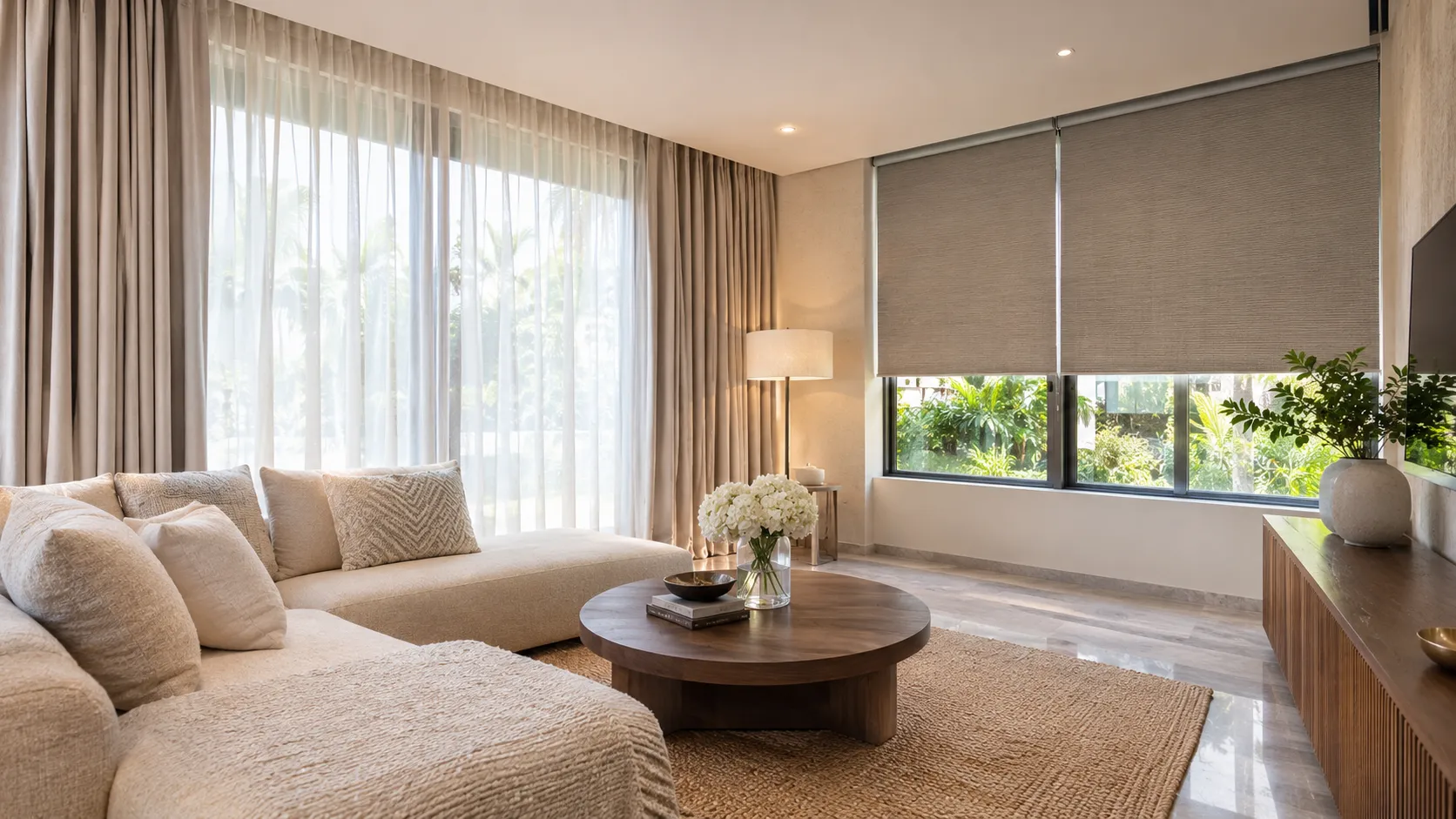
In a living room with neutral sofas and simple finishes, use one strong curtain color to frame the main glazing. Repeat that shade subtly in cushions or artwork rather than matching every accessory exactly. For wide windows, consider how the panels stack so they do not unnecessarily cover the glass when open.
Bedroom: bold color with a restful atmosphere
Deep blue, muted olive, warm brown, or burgundy can create a rich bedroom palette. If darkness is important, specify a suitable blackout lining or blackout fabric and check expected light gaps around the sides, top, and bottom. A blackout curtain does not automatically guarantee a completely dark room because installation details matter.
Dining area: add color without visual clutter
Use curtains to connect the dining area with nearby finishes. A warm earthy shade can complement timber furniture, while a dark contrast can define a dining zone in an open-plan layout. Keep table linens and decorative accessories simpler if the curtain is patterned or highly saturated.
Villa or hospitality property: make the design feel intentional
For villas, boutique accommodation, and hospitality spaces, statement curtains can strengthen the interior identity of a room. Consider the view, glazing size, exposure to sunlight, privacy needs, maintenance requirements, and how frequently the curtains will be operated. Select durable, practical materials as well as an attractive color.
Small room: use contrast with control
Bold curtains can work in a compact room, but scale and placement matter. A single strong color, a simple heading, and a relatively quiet surrounding palette can make the design feel deliberate. Avoid excessive pattern and bulky hardware where space is limited.
6. Practical Details to Check Before Ordering
A beautiful fabric sample is only one part of a successful curtain project. Accurate measurements and a suitable specification help the finished installation look as intended.
- Measure the installation area: confirm whether the curtain will be installed inside the recess, above the window, or from ceiling level.
- Confirm finished height: account for the track or pole, heading, floor level, and preferred clearance or break.
- Check fabric width and pattern repeat: these affect panel joins, fabric consumption, and pattern alignment.
- Choose the right lining: consider light control, privacy, fabric appearance, and room use.
- Check track capacity: the track, brackets, supports, and fixing method must suit the curtain's weight and span.
- Consider cleaning and care: follow the fabric supplier's care instructions and consider access for maintenance.
- Review the sample in the property: compare it against wall paint, flooring, upholstery, and daylight before confirming.
Use our Curtain Measuring Guide as a starting point. For planning how much space curtains may occupy when opened, try the Curtain Stacking Calculator.
7. Common Mistakes When Styling Bold Curtains
- Choosing color from a small screen image: screen settings and lighting can change how a fabric appears. Always check a physical sample when possible.
- Using too many competing accents: several strong colors and patterns can distract from the intended focal point.
- Ignoring fabric fullness: insufficient fabric can weaken fold definition and make the finished curtain look sparse.
- Overlooking the stack-back area: thick or full curtains need enough space to sit neatly when open.
- Choosing hardware only for appearance: tracks and poles must also be appropriate for curtain weight and installation conditions.
- Confusing decorative fabric with functional performance: confirm separately whether the room needs privacy, dimout, blackout, or UV-related protection.
- Skipping a final measurement check: small errors can affect floor clearance, alignment, and the overall finish.
8. Frequently Asked Questions
Are bold curtains suitable for minimalist interiors?
Yes. A strong curtain color or texture can become the main accent in a minimalist room. Keep the surrounding furniture, accessories, and patterns relatively simple so the curtains remain the focus.
What curtain colors make the strongest contrast with neutral walls?
Deep navy, forest green, charcoal, burgundy, and selected earthy shades can contrast effectively with light neutral walls. The best choice depends on the undertone of the wall, flooring, and furniture, as well as natural light.
Should statement curtains be plain or patterned?
Both can work. A solid color emphasizes tone and texture, while a pattern introduces movement and detail. If the room already contains prominent patterns, a solid curtain may be easier to balance.
Can bold curtains make a small room look smaller?
They can feel visually dominant if the color, pattern, or fabric volume is too heavy for the space. However, a controlled contrast, simple design, and carefully planned installation can make bold curtains work in smaller rooms.
Which curtain heading looks most modern?
Wave or S-fold headings are often chosen for contemporary interiors because they create consistent flowing folds. Pinch pleats can also look modern when the fabric, spacing, and track are specified carefully.
Can I combine bold curtains with sheer curtains?
Yes. A sheer and a decorative or blockout layer can provide flexibility for daylight, privacy, and nighttime use. Make sure the two layers have compatible tracks and enough space to operate independently.
How do I know how much fabric I need?
Fabric quantity depends on track width, heading type, desired fullness, fabric width, pattern repeat, and whether the curtains are single or double layer. Accurate site measurements and a fabric-specific calculation are recommended.
Make Your Windows Part of the Design
Bold curtains are most effective when they have a clear purpose. Start with the room's existing palette, choose one confident color or texture, and coordinate the heading, fullness, hardware, and practical requirements. The result can feel expressive while still belonging naturally to the architecture.
Almeers Living provides custom curtains and window treatment solutions for homes, villas, apartments, and hospitality properties in Bali. Explore our curtain and blinds collections, or visit Almeers Living to discuss fabric options, measurements, and installation requirements.